School Poster Maker Glossary
Explore everything you need to know about school poster makers on our comprehensive glossary page. From understanding the different types of poster makers and their features to tips on selecting the right equipment for your classroom or campus, this resource covers it all. Whether you’re a teacher, administrator, or part of a school tech team, this guide will help you make informed decisions and create vibrant, impactful posters for your school.
Shortcuts
-
- Types of School Poster Makers & Printing Equipment
- Basic Design & Layout Terminology
- Color & Image Terminology
- Typography Terminology
- Digital Tools & Interface Terminology
- Printing & Finishing Terminology
- Paper Types
- Ink Types
- Poster Specific Terminology
- Advanced Concepts & Design Principles
- Troubleshooting & Technical Terms
- Tips & Best Practices
1.1 Poster Makers
- Definition: Specialized systems (often large-format printers with design software) that allow users to produce high-quality posters and banners in-house.
- Types:
- School Poster Makers: User-friendly, simplified interfaces, preset templates; ideal for student assignments, science fairs, or classroom announcements.
- Professional Poster Makers: Offer advanced color management, higher resolutions, and multiple paper-handling options for retail, corporate, or high-end academic needs.
- Importance (for Schools): Facilitate quick printing of educational materials without needing external print shops, saving time and budget.
1.2 Large-Format Printers
- Definition: Printers capable of producing outputs wider than standard desktop models—ranging from 18 inches to several feet.
- Advantages: High resolution, vibrant color output, and compatibility with various media types (paper, vinyl, fabric).
- Common Uses: Marketing signage, event promotions, art prints, architectural blueprints, and trade show banners—also perfect for eye-catching school hallway displays.
1.3 Latex Printers
- Definition: Utilize water-based latex inks that cure through heat, offering durability with reduced environmental impact compared to solvent-based systems.
- Key Benefits: Quick-drying prints, scratch-resistant finishes, fewer fumes (lower VOCs), and safer for classroom settings.
1.4 Printer Cutters
- Definition: Machines that both print on a chosen media and then automatically cut the design to shape.
- Usage: Ideal for decals, stickers, custom labels, or shaped graphics like mascot logos or intricate lettering.
- Cutting Mechanisms: Often use optical sensors for contour cutting, ensuring precise outlines.
1.5 Sublimation Printers
- Definition: Employ heat to transfer dye onto fabrics or specially coated surfaces.
- Popular Uses: Apparel (T-shirts, sports jerseys), soft signage, personalized gifts (mugs, phone cases). Perfect for school spirit gear and fundraising items.
2.1 Canvas, Work Area, and Artboard
- Canvas: The digital or physical surface where you create your design. In online poster makers, the canvas is typically the white or blank workspace where you arrange text, images, and other elements.
- Work Area: The broader environment surrounding the canvas. It may include additional margins, rulers, or guidelines not visible on the final product.
- Artboard: A term commonly used in professional design software. It refers to the printable/designable area where all components (text, images, shapes) of your poster are placed.
2.2 Layout and Composition
- Layout: The arrangement of all elements (text, images, shapes, etc.) on your poster. A well-considered layout ensures clarity, visual interest, and effective communication of your main message.
- Composition: The overall organization and relationship between visual elements in your design. A strong composition leads the viewer’s eye through the poster in a logical, impactful way.
- Hierarchy: The way design elements are arranged to show the order of importance. Larger, bolder, or more colorful elements typically stand out more and thus have higher hierarchy.
- Alignment: The process of lining up text and graphic elements in a visually consistent manner (e.g., left, right, center, or justified alignment). Good alignment creates a clean, organized look.
- White Space / Negative Space: The empty or open areas of your layout. White space helps draw attention to key parts of the design and prevents clutter.
- Grid: A structural system of vertical and horizontal lines used to arrange elements in a more organized and consistent manner.
- Margins: The blank borders along the edges of the poster that define the printable area. Margins help ensure that important design elements aren’t cut off when printing.
- Bleed: An extra margin (beyond the final printed edge) added to ensure the background or images extend fully to the paper’s edge after trimming.
2.3 Templates
-
- Template: A pre-made layout or design that you can customize by changing text, colors, images, and other elements. Poster maker websites often provide a library of templates to help you get started quickly.
- Preset Dimensions / Sizes: Standard poster sizes (like 8.5” x 11”, 11” x 17”, or A4, A3, etc.) that templates often follow. Choosing a preset ensures your design is easily printable on common paper sizes.
3.1 Color Models
- RGB (Red, Green, Blue): A color model used for digital screens. It’s an additive color model, meaning colors are created by adding light (red, green, and blue). Posters designed in RGB might look slightly different when printed.
- CMYK (Cyan, Magenta, Yellow, Key/Black): A color model used in printing. It’s a subtractive color model, meaning colors are created by subtracting light. Design for print often requires converting or designing directly in CMYK for the most accurate color output.
- Hex Code: A six-digit code used primarily for web design (e.g., #FF5733). Poster maker websites may allow hex code entry to match exact brand or school colors.
3.2 Color Terminology
- Hue: The attribute of color that defines its base, like red or blue.
- Saturation: The intensity or purity of a color. High saturation colors are very vibrant; low saturation colors are more subdued.
- Brightness / Value: How light or dark a color appears.
- Contrast: The difference in visual properties (like color or brightness) that makes an object distinguishable from others. High contrast designs typically have strong visual impact.
3.3 Image and Photo Manipulation
- Resolution: The detail level of an image, often expressed in pixels per inch (PPI) or dots per inch (DPI). Higher resolution means better print quality.
- DPI (Dots per Inch) / PPI (Pixels per Inch): Both measure image resolution. In printing contexts, DPI refers to how many dots of ink per inch are laid down on paper. PPI refers to how many pixels fit into an inch on a screen.
- Cropping: Removing unwanted outer areas of an image to improve framing or composition.
- Scaling / Resizing: Changing the dimensions of an image. Maintaining the aspect ratio (proportional width and height) is important to avoid distortion.
- Filters: Preset settings or tools that adjust color, contrast, brightness, and other attributes of an image to achieve a certain look or style.
- Opacity / Transparency: The degree to which an element (image, shape, text box) blocks what’s behind it. Lower opacity means more transparency.
3.4 Image File Formats
- JPEG (Joint Photographic Experts Group): A common image format that uses lossy compression, ideal for photographs.
- PNG (Portable Network Graphics): An image format that supports lossless compression and transparency. Often used for graphics, logos, or any image requiring a clear background.
- SVG (Scalable Vector Graphics): A vector format used for simple graphics and logos that need to scale without losing quality.
- GIF (Graphics Interchange Format): An older format supporting animation and limited colors, not typically ideal for print posters.
4.1 Font Basics
- Font / Typeface: A set of characters (letters, numbers, punctuation) in a specific style. Technically, “typeface” is the design style and “font” is the file that contains the design, but in modern usage the terms are often interchangeable.
- Font Family: A group of related typefaces with shared design traits but variations in weight (bold, light, regular) or style (italic).
4.2 Font Styles and Weights
- Regular: The standard version of a typeface, with no extra boldness or italicization.
- Bold: A thicker, heavier version of a typeface used to emphasize text.
- Italic: A slanted version of a typeface commonly used for emphasis or to denote titles of works.
- Light / Extra Light / Thin: Fonts with less weight and thickness. They provide a more delicate, airy look.
- Condensed: A version of a typeface designed to have narrower letterspacing, allowing more text to fit in a given space.
4.3 Typesetting & Spacing
- Leading (Line Spacing): The vertical space between lines of text. Increasing leading can improve readability.
- Tracking (Letter Spacing): The overall space between characters. Used to adjust the density of text across an entire word or line.
- Kerning: The space between individual pairs of characters to improve visual consistency.
- Alignment (Left, Right, Center, Justified): Determines how text lines up horizontally. Justified text stretches lines to both margins by adjusting spacing.
4.4 Advanced Typography Concepts
- Serif Fonts: Fonts that have small “feet” or strokes at the ends of each letter (e.g., Times New Roman). Often used for more traditional or formal designs.
- Sans Serif Fonts: Fonts without serifs (e.g., Arial, Helvetica). Often used for modern, clean designs.
- Display Fonts: Highly stylized fonts that work best for headlines or decorative text.
- Script Fonts: Fonts designed to look like cursive or handwriting, often used for invitations or elegant posters.
- X-Height: The height of a lowercase letter “x,” used as a reference for how tall basic lowercase letters are in a font.
5.1 Interface & Editing Tools
- Toolbar: The collection of icons or options that allow you to perform editing actions like drawing shapes, adding text, cropping images, etc.
- Menu Bar / Drop-Down Menu: A common navigation element that lists commands and features (e.g., File, Edit, View, etc.).
- Layers: Concept borrowed from professional design software. Each element (text box, image, shape) can reside on its own layer. Layers help you arrange elements in front or behind each other.
- Undo / Redo: Commands to revert or reapply your most recent action. Essential for quickly correcting mistakes.
- Guides / Rulers: On-screen visual indicators that help you align and measure elements accurately.
- Snap to Grid / Snap to Guides: A feature that automatically aligns elements to a grid or guide, ensuring precise placement.
5.2 File Management
- Save: Stores your current project to edit later. Some poster maker websites auto-save progress to your account.
- Export: Converts your project into a final format (e.g., PDF, JPEG, PNG) for printing or sharing.
- Version History: A feature some web-based tools offer to revert to previous saves or see changes made over time.
5.3 Collaboration Features
- Share Link: A unique URL that can be sent to collaborators or teachers for feedback, viewing, or editing.
- Commenting / Annotation: Tools that allow collaborators or teachers to leave feedback directly on the poster design.
- Real-Time Collaboration: Multiple people editing the same poster simultaneously, often with color-coded cursors or user icons.
6.1 Print Specifications
- Resolution for Print: Posters generally need images at 300 DPI for crisp printing. Lower resolutions can cause pixelation.
- Trim Size: The final dimensions of a printed piece after cutting.
- Safe Area: The area inside the trim edges where all important content (text, logos) should remain to avoid being trimmed off.
6.2 Printing Methods
- Digital Printing: A method that uses digital files (like PDFs) and prints them directly using laser or inkjet technology. Ideal for low-volume or quick-turnaround prints.
- Offset Printing: Uses plates and ink for higher-volume production. More cost-effective in large quantities and often yields more accurate colors.
- Large Format Printing: A specialized printing method for oversized materials like large posters, banners, or billboards.
6.3 Finishing Options
- Lamination: A thin layer of plastic film applied to the surface of a poster, protecting it from moisture, wear, and tear.
- Mounting: Adhering a poster onto a backing board for durability and display purposes.
- Grommeting: Inserting metal rings in banner corners for hanging.
- Trimming / Cutting: The process of removing excess paper (including bleed) to achieve the final poster size.
- Folding: Some posters may be folded for mailing or distribution. Folding lines can be indicated in the design phase with guides.
7.1 Everyday Paper
7.1.1 Standard Poster Paper
A versatile, lightweight paper suitable for everyday use. Ideal for short-term displays and indoor posters.
7.1.2 Coated Poster Paper
Features a smooth surface that enhances color vibrancy and sharpness. Suitable for presentations and educational materials requiring high-quality images.
7.1.3 Heavyweight Coated Paper
Thicker than standard coated paper, offering increased durability and opacity. Perfect for posters with rich graphics and extended indoor use.
7.1.4 Lightweight Translucent Poster Paper
Semi-transparent paper that allows light to pass through, creating a soft, diffused effect. Commonly used for backlit displays and creative projects.
7.2 Photo Paper
7.2.1 Satin Photo Paper
Provides a semi-gloss finish that balances color vibrancy with reduced glare. Ideal for photographic prints and posters requiring a professional appearance.
7.2.2 Gloss Photo Paper
Delivers a high-gloss, shiny finish that enhances color depth and sharpness. Best for vibrant, eye-catching images and posters.
7.2.3 Premium Photo Paper
High-quality paper designed for superior image reproduction, offering excellent color accuracy and longevity. Suitable for archival prints and high-end presentations.
76.3 Vinyls & Signage Paper
7.3.1 Adhesive Wall and Floor Signage Vinyl
Durable vinyl material with a sticky backing, designed for creating signs and graphics that adhere to walls and floors. Ideal for directional signage and decorative graphics in schools.
7.3.2 Outdoor Banner Vinyl
Weather-resistant vinyl designed to withstand outdoor conditions. Suitable for school events and announcements displayed outside.
7.3.3 Gloss Repositionable Vinyl
Shiny vinyl material with a removable adhesive, allowing for easy repositioning without leaving residue. Perfect for temporary displays and classroom decorations.
7.3.4 Indoor Banner Vinyl
Lightweight vinyl suited for indoor use, offering a smooth finish for vibrant graphics. Ideal for banners and signs within school facilities.
7.3.5 Permanent Adhesive Indoor Banner Vinyl
Vinyl material with a strong adhesive for long-lasting indoor displays. Best for signs and posters intended for extended use.
7.3.6 Satin Outdoor Vinyl with Permanent Adhesive
Semi-gloss vinyl designed for outdoor use, featuring a durable adhesive for permanent applications. Suitable for long-term outdoor signage.
7.4 Films & Specialty Paper
7.4.1 White Polyester Film
A synthetic, tear-resistant material offering high durability and excellent print quality. Ideal for frequently handled posters and educational materials.
7.4.2 Cotton Art Canvas
Textured canvas made from cotton, providing a classic artistic appearance. Perfect for reproducing artwork and creating high-quality educational visuals.
7.4.3 Clear Transparency Film
Transparent film used for creating overlays and projector sheets. Commonly utilized in teaching aids and presentations.
7.4.4 Water-Resistant Poly Cloth
Fabric-like material that resists water, suitable for both indoor and outdoor use. Ideal for banners and posters exposed to moisture.
7.4.5 Vellum Paper
Translucent paper with a smooth surface, often used for tracing and overlaying designs. Useful in art and design classes for creating layered projects.
7.4.6 Magnetic Paper
Flexible magnetic sheets that can be printed on, allowing posters to adhere to metal surfaces. Ideal for creating movable displays and interactive educational tools.
7.4.7 Repositionable Fabric
Fabric material with a removable adhesive backing, enabling easy application and repositioning on various surfaces. Suitable for wall graphics and classroom decorations that can be moved as needed.
8.1 Classroom Pro Poster Maker Ink
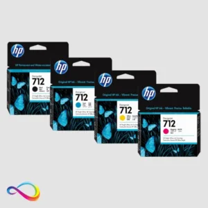
- Overview: Designed for select HP DesignJet printers, HP 712 Ink offers sharp lines and vibrant colors, making it ideal for technical drawings, CAD renderings, and other precision-oriented documents.
- Key Characteristics:
- Water-Based Formulation: Delivers crisp results with lower environmental impact compared to solvent-based inks.
- Compatibility: Commonly used with HP’s latest T-series DesignJet models for architectural and engineering prints.
- Color Accuracy: Offers high-quality color consistency for reliable, repeatable prints.
- Applications: Perfect for detailed line work, blueprint printing, posters, and smaller-scale graphics where precision and clarity are paramount.
8.2 Campus Pro Poster Maker Ink
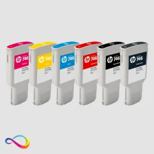
- Overview: A higher-end pigment ink set designed for HP’s large-format photo and graphics printers. HP 746 and HP 738 is optimized for professional photo-quality output, including fine art, high-end graphics, and proofs.
- Key Characteristics:
- Pigment-Based: Provides longer print permanence and fade resistance compared to dye-based inks.
- Extended Color Gamut: Delivers rich, vibrant tones and subtle gradations, ideal for photo-realistic prints.
- Robust Archival Quality: Suitable for gallery displays, prints for sale, and lasting exhibition pieces.
- Applications: Often used by professional photographers, artists, print shops, and design studios requiring top-tier image quality and archival durability.
8.3 TeacherCraft Pro 20+ / 20 Poster Printer Cutter Ink
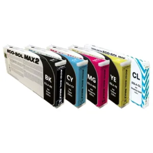
- Overview: Roland’s Eco-Sol Max2 is an eco-solvent ink engineered for wide-format printing, popular among sign makers and graphics professionals.
- Key Characteristics:
- Eco-Solvent Formula: Lower odor, reduced VOCs, and user-friendly operation compared to traditional solvent inks.
- Fast-Drying & Scratch-Resistant: Inks bond quickly to various materials and resist fading, scratching, and weathering.
- Wide Material Compatibility: Suitable for vinyl, banner, canvas, and various coated/uncoated substrates.
- Applications: Excellent for indoor and outdoor signage, vehicle wraps, decals, banners, and long-lasting graphic displays.
8.4 TeacherCraft Pro 30 / 64 Poster Printer Cutter Ink
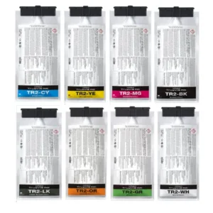
- Overview: TrueVIS TR2 is Roland’s second-generation ink line for TrueVIS series printers and printer/cutters, delivering vibrant colors with improved efficiency and durability.
- Key Characteristics:
- High-Intensity Pigments: Offers strong color saturation and smooth gradations, even at high speeds.
- Quick-Drying & Stretchable: Ideal for applications like wraps or heat transfers that require flexibility.
- GREENGUARD Gold Certified: Meets environmental and safety standards, suitable for sensitive indoor settings (e.g., schools, hospitals).
- Applications: Ideal for professional sign shops, custom apparel creators, and anyone producing eye-catching indoor/outdoor graphics that demand both vibrancy and longevity.
8.5 Fundraiser Pro Sublimation Ink
- Overview: Sawgrass SUBLIJET UHD is a dye-sublimation ink designed specifically for Sawgrass sublimation printers, delivering rich, detailed, and durable prints on polyester and polymer-coated surfaces.
- Key Characteristics:
- Dye-Sublimation Formula: Inks turn into gas under heat and pressure, bonding permanently into the surface for vivid, long-lasting images.
- Ultra High Definition: Provides crisp details and bright colors on garments, mugs, phone cases, and other promotional items.
- Easy Color Management: Integrated with Sawgrass software solutions for consistent, predictable color output.
- Applications: Widely used by small businesses, hobbyists, and professional custom-product makers for items like T-shirts, mugs, keychains, and other sublimation-friendly merchandise.
9.1 Poster Types and Purposes
- Educational Poster: Typically found in classrooms, focusing on a specific topic or concept to aid learning.
- Event Poster: Promotes an upcoming event (school fairs, conferences, plays). Often includes date, time, venue, and contact info.
- Motivational Poster: Designed to inspire, often with quotes, images, or an impactful tagline.
- Informational Poster: Lays out facts, charts, or infographics to convey data or instructions clearly.
9.2 Branding & School Identity
- Brand Colors: Official school or organization colors. Maintaining consistent brand colors in posters helps strengthen recognition.
- Logo Placement: The designated area where you must place a school or organization’s logo. Many schools have strict guidelines on logo size and placement.
- Slogan / Motto: A catchphrase or short statement representing the values and goals of the school or event.
9.3 Accessibility Considerations
- Font Legibility: Choosing a clear font face and sufficient text size so viewers of all ages can easily read the content.
- Color Contrast for Accessibility: Ensuring text color stands out against the background, aiding visibility for visually impaired students or viewers.
- Plain Language: Writing text that’s easily understandable by the intended audience. This is especially crucial for primary or secondary school settings.
10.1 Gestalt Principles
- Proximity: Elements that are close together are perceived as related.
- Similarity: Elements that share color, shape, or size are seen as related.
- Closure: The brain fills in missing information to see a complete shape.
- Figure-Ground: The ability to distinguish a foreground object from its background.
10.2 Visual Flow & Eye Movement
- Focal Point: The main area of interest where you want to draw the viewer’s attention.
- Z-Pattern / F-Pattern: Common eye-reading patterns (especially in posters and websites). Understanding these helps position key elements in areas more likely to be noticed first.
10.3 Branding & Identity in Poster Design
- Consistency: Using the same fonts, color schemes, and styles across multiple posters or materials to build recognition and trust.
- Style Guide: A collection of rules about how a brand’s logos, fonts, and colors should be used to maintain visual identity.
11.1 Common Issues
- Pixelation: When an image is scaled too large, causing visible blocky pixels.
- Color Shift: The difference in color appearance between screen and printed output. Usually corrected by color calibration or using CMYK color mode.
- File Compatibility: Ensuring the poster file can be opened by different programs without losing formatting or information.
11.2 Performance & Loading
- Caching: Temporary storage of certain elements so the website loads faster on repeat visits.
- Bandwidth: The amount of data transferred between your device and the server when uploading or downloading images. High-resolution images require more bandwidth.
- Cloud Storage: The online space where your poster files, images, or design assets are saved, accessible from any device with an internet connection.
Select the Right Paper: Match the finish (matte, gloss, satin) to the content—gloss for photo-heavy, matte for text-heavy.
Optimize Images: Use high-resolution (300 DPI) images for crisp results.
Use White Space: Improves readability and prevents overcrowding of text and images.
Color Conversion: Always convert designs to CMYK before printing.
Proofread Thoroughly: Spelling or grammatical errors can undermine the professionalism of classroom or event posters.
Check Printer Settings: Double-check orientation, size, margins, and bleed before the final print.
Go Green: Consider recycled paper or lower-VOC inks for environmentally friendly printing.
Keep it Simple: Less is often more—especially for quick-glance educational posters.

