Phonics in Full Color for Multi-Sensory Letter Learning
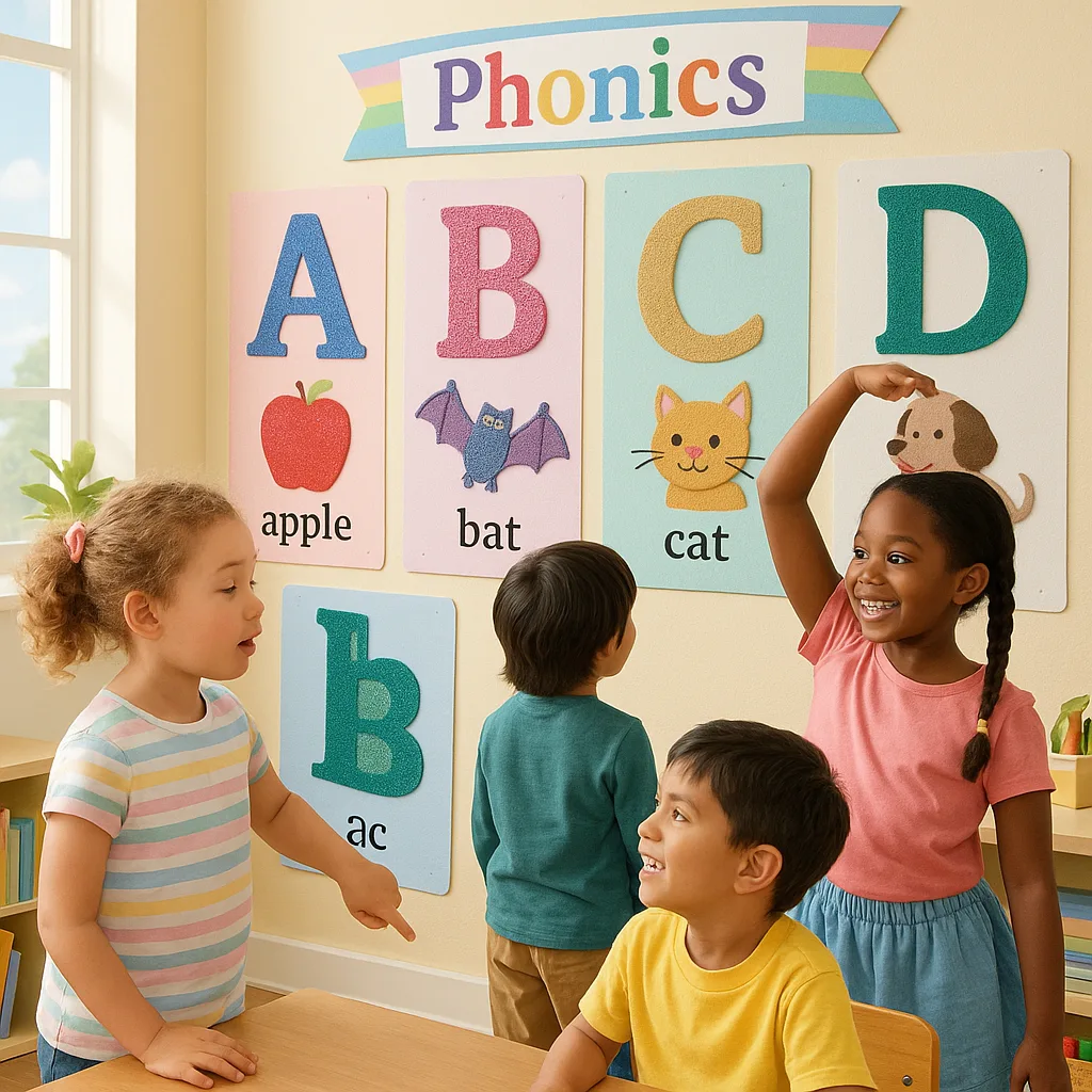
Picture this: It’s Monday morning, and little Emma is tracing a giant fuzzy letter “F” on our phonics wall while making the /f/ sound. Meanwhile, Marcus is jumping on our floor letters, physically hopping from “C” to “A” to “T” to spell “cat.” The room is alive with learning, and it all started with a simple poster print machine and a wild idea to make phonics truly touchable!
I’ll be honest—when I first started teaching, I thought phonics posters were just… well, posters. You know, those alphabet strips above the whiteboard that kids stare at blankly? But after attending a workshop on multi-sensory learning (and maybe having one too many coffees), I realized we could transform these visual aids into full-body learning experiences. And let me tell you, the difference has been AMAZING!
Today, I’m sharing everything I’ve learned about creating multi-sensory phonics displays that actually work. We’ll dive into color-coding systems, texture additions, movement cues, and yes—I’ll even share my printable templates that have saved my teacher sanity more times than I can count!
Visual Learners
Benefit from color-coded letter groups
Kinesthetic Learners
Need movement and touch
Auditory Learners
Connect sounds with visuals
Every classroom has this beautiful mix of learning styles, and our phonics displays should reflect that diversity. That’s where having a reliable poster print machine becomes a game-changer—you can create multiple versions of the same content to meet different needs!

The beauty of using quality poster paper is that these colors really POP! I learned the hard way that regular printer paper just doesn’t cut it when you’re adding textures and having little hands touch everything approximately 847 times per day.
Sandpaper Letters
Perfect for those tricky letters like 'b' and 'd'How It Helps
The rough texture helps create muscle memory as kids trace. I use fine-grit sandpaper (nothing too scratchy!) cut into letter shapes. Pro tip: Let kids help with the gluing—they take SO much more ownership when they’ve helped create it!Fabric & Felt
Soft textures for gentle sounds like 'M' and 'L'Sensory Benefits
Velvet for vowels, corduroy for hard consonants—the texture matches the sound! My students love predicting what each letter will feel like. We even created a “texture alphabet book” as a class project!Glitter Glue Outlines
Because everything's better with sparkles!Visual & Tactile
Once dry, glitter glue creates raised, bumpy lines kids can trace with their fingers. I use it for letter formations and to highlight special features like the “tail” on lowercase ‘g’ or the “dot” on ‘i’.Pipe Cleaner Borders
Bendy, fuzzy, and oh-so-fun to touch!3D Learning
These work great for showing letter formations. Kids can actually bend and shape them to understand how letters are formed. Plus, they’re colorful and add a 3D element that really makes letters pop off the page!Quick Tip: Always laminate BEFORE adding textures! I learned this the hard way when my beautiful poster got soggy during our “splash zone” water table day. Now I use the cold laminator first, then add textures on top!
Using your poster maker machine, print large arrows showing letter formation. Start with a green dot (go!) and end with a red dot (stop!). Kids physically walk the letter path!
Take photos of students making letter shapes with their bodies, then print them as part of your display. “Look! That’s me being the letter Y!”
Each letter gets its own movement: “T” is arms stretched wide, “O” is a spin, “P” is a hop on one foot. Print these as visual cue cards next to each letter!
Step 1: Design Your Base Posters
Start with simple, bold letter designs. I use 300-point font minimum (yes, HUGE!) because remember, we’re adding textures that might cover some edges. Leave plenty of white space around each letter for:
• Texture additions
• Movement arrows
• Picture associations
• Student work samples
Pro tip: Design your posters in sets—uppercase, lowercase, and letter combinations. This way, you can rotate them based on what you’re teaching!
Step 2: Print on Quality Media
This is crucial, friends! I cannot stress enough how important it is to use proper poster materials. After trying everything from regular paper (disaster) to photo paper (too expensive), I’ve found that coated poster paper gives the perfect balance of durability and affordability.
For extra-special letters (like those tricky vowel teams), I splurge on the glossy finish. It makes the colors absolutely POP and kids are naturally drawn to them!
Step 3: Laminate for Longevity
Before adding any textures, run your posters through a laminator. This protects the base print and gives you a smooth surface to adhere textures to. Plus, if a texture falls off (and trust me, they will), you can easily re-attach without damaging your original poster.
Step 4: Add Your Multi-Sensory Elements
This is where the magic happens! Set up texture stations and let students help (with supervision, of course). I learned that hot glue guns + first graders = chaos, so we stick to glue sticks and double-sided tape for most additions.
Here’s my texture shopping list:
• Sandpaper (various grits)
• Felt squares
• Fabric scraps
• Pipe cleaners
• Foam shapes
• Glitter glue
• Textured scrapbook paper
• Bubble wrap (for the letter ‘B’—get it? 😄)
The best part? When you have your own poster printing setup, you can customize everything! Last week, I created special posters for Maria, who’s learning English. I made bilingual letter cards with textures that reminded her of words in both languages. The smile on her face when she saw them? Priceless! 🌟
Speaking of customization, I’ve found that the cost per print is surprisingly affordable when you’re making materials that last all year. Plus, no more last-minute runs to the teacher store!
Tips for Getting Started
If you’re feeling overwhelmed (I get it—I felt the same way!), here’s my advice for getting started with multi-sensory phonics displays:
1. Start Small: Pick 5 letters that your class struggles with most. Create amazing multi-sensory posters for just those letters first.
2. Involve Your Students: They LOVE helping create these displays. Plus, they learn so much in the process!
3. Use What You Have: Before investing in fancy textures, raid your craft closet. Old fabric scraps, used sandpaper, even bubble wrap can work!
4. Document Everything: Take photos of your creations. You’ll want to recreate your favorites next year (trust me on this one).
5. Share with Colleagues: Once other teachers see your amazing displays, they’ll want in! Consider hosting a “Phonics Poster Party” where everyone creates materials together.
Having the right tools makes all the difference. When I got access to our school’s Classroom Pro 24 Poster Maker Elite Package, it was a game-changer. No more tiny prints or waiting for the copy center!