Classroom Poster Maker for Special Education Design
Understanding the Science Behind Color and Special Needs
Research in environmental psychology reveals that color perception directly influences neurological responses, particularly in individuals with sensory processing differences. Students with autism spectrum disorder, ADHD, sensory processing disorder, and other special needs often experience heightened sensitivity to visual stimuli. Therefore, the colors we choose for classroom displays can either support or hinder their ability to focus, self-regulate, and engage with learning materials.
Dr. Temple Grandin’s groundbreaking work on sensory experiences highlights how visual environments can trigger either calming or overwhelming responses in neurodiverse individuals. Similarly, studies published in the Journal of Environmental Psychology demonstrate that specific color wavelengths can influence cortisol levels, heart rate variability, and attention span—all critical factors in special education settings.
When educators invest in a quality poster printer machine, they gain the power to customize these visual elements precisely to their students’ needs. Unlike generic commercial posters, custom-designed materials allow teachers to control every aspect of the visual experience, from color saturation to contrast levels.

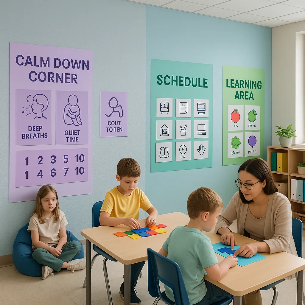
The Calming Palette: Blues and Greens for Emotional Regulation
Blue wavelengths have been scientifically proven to activate the parasympathetic nervous system, promoting a sense of calm and reducing anxiety. For students who struggle with emotional dysregulation or hyperactivity, incorporating soft blues (think sky blue or powder blue) into visual supports can create an immediate soothing effect. However, it’s crucial to avoid overly bright or electric blues, which can be overstimulating.
Green, nature’s dominant color, offers similar calming properties while also supporting sustained attention. Research from the University of Essex found that viewing green spaces—even in photographic form—reduced stress markers by up to 30%. When creating posters for calm-down corners or quiet zones, consider using sage greens, mint tones, or soft forest hues.
Practical Application: Design a visual schedule using a soft blue background with green accent borders. This combination provides structure without overwhelming sensitive nervous systems. The Campus Pro 24 Poster Maker allows you to print these schedules in large formats, making them easily visible from across the classroom.
Color Psychology Quick Guide:
Calming Colors:
• Soft blues
• Sage greens
• Lavender
• Neutral grays
Focusing Colors:
• Deep teals
• Forest greens
• Muted purples
Energizing Colors:
• Warm yellows
• Soft oranges
• Coral tones
Colors to Use Sparingly:
• Bright reds
• Electric blues
• Neon shades
• High-contrast combinations
Creating Focus with Classroom Poster Maker Special Education Tools
While calming colors serve their purpose, there are times when we need to help students increase alertness and maintain focus. This is where warmer colors come into play—but with important modifications for special needs populations.
Yellow, when used correctly, can improve concentration and stimulate mental activity. However, bright yellows can trigger anxiety in some students. Instead, opt for buttery yellows, warm creams, or golden tones. These softer variations provide the cognitive benefits without the sensory overload.
Orange presents similar opportunities and challenges. Research indicates that orange can increase oxygen supply to the brain, enhancing mental function. For students with attention difficulties, strategic use of muted orange accents—think terracotta or peach—can help maintain engagement without causing overstimulation.

The Classroom Pro 24 Advanced Package enables precise color control for focus-enhancing posters.
Sensory-Friendly Design Principles Beyond Color
Creating truly therapeutic classroom visuals requires attention to multiple design elements beyond color selection. As someone who has conducted countless classroom observations, I’ve identified several key principles that make the difference between helpful and overwhelming visual supports.
Contrast and Clarity: Students with visual processing challenges need clear contrast between text and background, but extreme black-on-white combinations can cause visual stress. Instead, consider navy text on cream backgrounds or dark gray on pale blue. These combinations provide necessary contrast while reducing eye strain.
White Space as a Design Tool: One of the most common mistakes I see is overcrowded posters. For students with attention difficulties or sensory sensitivities, visual clutter creates cognitive overload. Aim for at least 40% white space on any educational poster. This “visual breathing room” allows the brain to process information more effectively.
Typography Matters: Font selection significantly impacts readability for students with dyslexia or visual processing disorders. Sans-serif fonts like Arial or specialized fonts like OpenDyslexic provide clearer letter differentiation. When using a classroom poster printer machine, ensure your chosen fonts maintain clarity even at larger sizes.
Implementing Zone-Based Color Strategies
One evidence-based approach I frequently recommend involves creating distinct visual zones within the classroom, each with its own color psychology profile. This strategy helps students understand behavioral expectations and emotional states associated with different areas.
The Regulation Zone: Designate a calm-down area using blues, greens, and soft purples. Visual supports in this zone might include breathing exercise posters, emotion identification charts, and calming imagery—all printed with soothing color palettes.
The Learning Zone: Use balanced, focusing colors like teal, soft gold, and warm gray for instructional areas. These colors maintain alertness without overstimulation, supporting sustained attention during lessons.
The Movement Zone: For areas designated for physical activity or sensory breaks, incorporate energizing but controlled colors like coral, warm yellow, or soft orange. However, always pair these with grounding neutrals to prevent sensory overload.
When schools invest in their own poster maker machine, teachers can quickly adapt these zones based on student needs, seasonal changes, or specific therapeutic goals. This flexibility proves invaluable in special education settings where individualization is paramount.
Practical Implementation: From Theory to Classroom Reality
Understanding color psychology is one thing; implementing it effectively is another. Here’s where having a dedicated classroom poster maker special education professionals can rely on becomes invaluable. Let me share some practical strategies I’ve developed through years of collaboration with special education teams.
Start with Assessment: Before designing any visual supports, observe your students’ responses to existing classroom colors. Note which areas seem to calm or agitate them. Some students may have strong color preferences or aversions that override general principles.
Create Personalized Visual Supports: Using a quality poster printer machine, develop individualized materials that match each student’s sensory profile. For example, a student with autism who finds comfort in predictable patterns might benefit from visual schedules featuring their preferred shade of blue with consistent geometric borders.
Test and Iterate: The beauty of having in-house printing capabilities is the ability to quickly modify designs based on student responses. If a poster’s color scheme proves too stimulating, you can immediately create a calmer version without waiting for external printing services.
Involve Students in the Process: When appropriate, allow students to participate in color selection for their personal visual supports. This ownership can increase buy-in and effectiveness while teaching self-advocacy skills.
Cost-Effective Solutions for Resource-Limited Programs
I understand that special education programs often face budget constraints. However, the long-term benefits of investing in a classroom poster maker far outweigh the initial costs. Consider these factors:
Traditional outsourced printing for specialized visual supports can cost hundreds of dollars monthly. A single behavior chart or visual schedule from a commercial printer might run $20-50. Meanwhile, with your own printer, the cost per print drops to just dollars per poster.
Furthermore, the ability to create materials on-demand means you can respond immediately to changing student needs. When a new student joins your class mid-year with specific sensory requirements, you can have customized supports ready within hours, not weeks.
Many schools have successfully used various funding sources including special education grants, PTA support, and Title I funds to acquire their poster-making equipment. The investment typically pays for itself within the first semester through reduced outsourcing costs.
Measuring Success: Beyond Aesthetics
As we wrap up this exploration of therapeutic color design, I want to emphasize the importance of data-driven decision making. Beautiful posters mean nothing if they don’t support student outcomes. Here’s how to measure the effectiveness of your color psychology implementations:
Behavioral Observations: Track specific behaviors before and after introducing new color-coded visual supports. Are students spending more time in the calm-down corner? Has on-task behavior increased in areas with focusing colors?
Student Feedback: Even non-verbal students can indicate preferences through eye gaze, approach/avoidance behaviors, or assistive technology. Document these responses to refine your designs.
Stress Indicators: Monitor physiological signs of stress or calm, such as body tension, stimming behaviors, or emotional outbursts. Effective color choices should correlate with reduced stress indicators over time.
Academic Progress: While color alone won’t solve learning challenges, appropriate visual environments can remove barriers to engagement. Track whether students show improved attention to visual learning materials after color optimization.
Remember, every student is unique. What creates calm for one child might energize another. The true power of having a classroom poster maker special education teams can customize lies in this ability to individualize supports based on ongoing assessment.
Creating therapeutic classroom environments is an ongoing journey of observation, creativity, and compassion. With the right tools and understanding, we can design spaces that not only teach but heal.