Poster Machine Maker Visual Syllabus Design
Level Up Your Classroom with #VisualLearning
Say goodbye to text walls and hello to visual course roadmaps that actually work!
Hey there, fellow educators! Let’s talk about something that’s been buzzing in teacher lounges and education Twitter threads lately—the death of the boring syllabus. You know what I mean, right? That multi-page document students glance at once (if we’re lucky) and then promptly forget exists. Well, I’ve been experimenting with something that’s completely changed the game in my classroom: using our poster machine maker syllabus design approach to create visual course maps that students actually reference all semester long.
” to “Summit (Finals Week)”.")
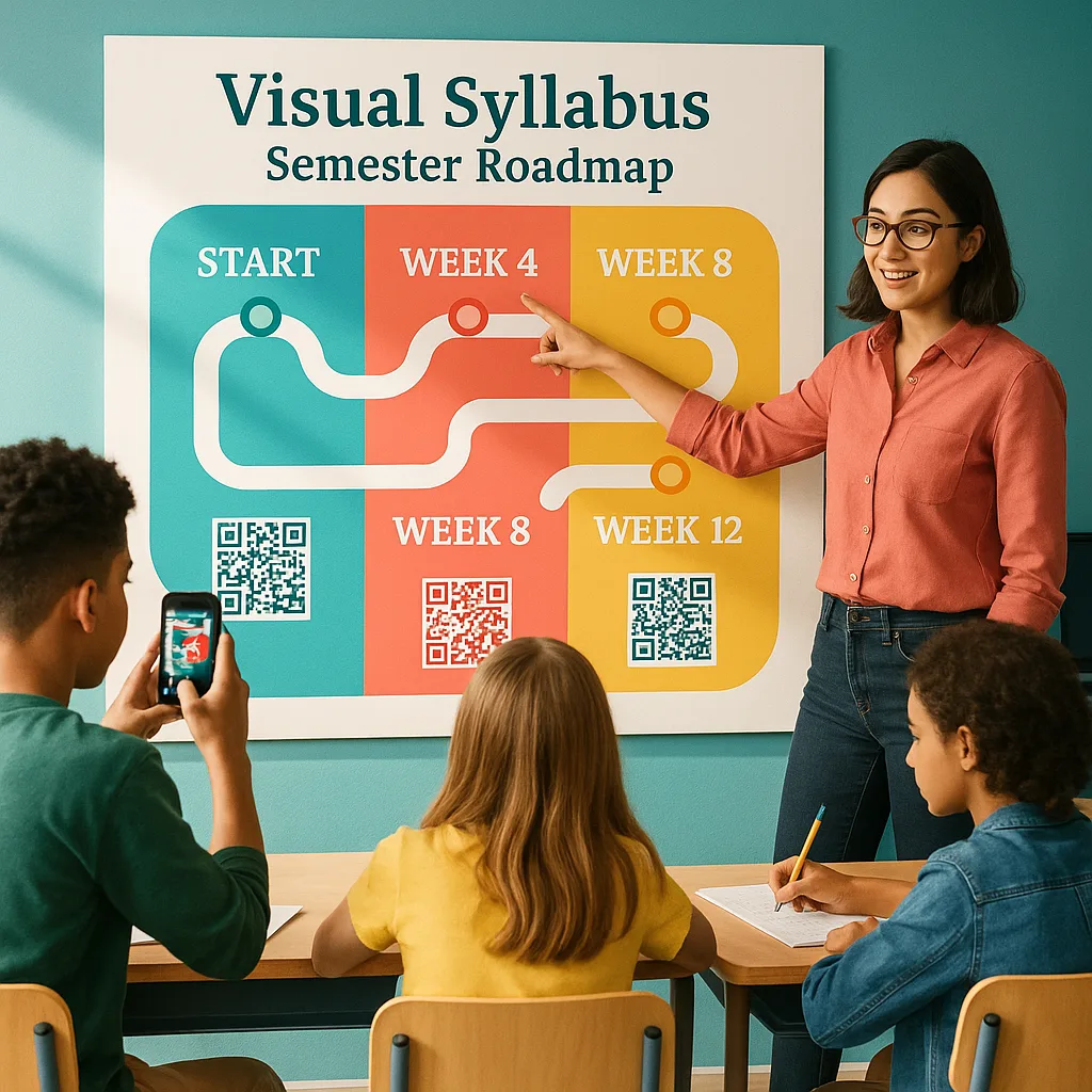
The Anatomy of a Poster Machine Maker Syllabus Design
of students prefer visual course roadmaps
report better assignment tracking
feel more confident about course expectations
Design Principles That Work
Let me share what I’ve learned about making these visual syllabi actually work in the classroom. First, white space is your friend! I know it’s tempting to fill every inch of that beautiful poster paper from your printer for posters, but resist the urge. Students need visual breathing room to process information.
Second, think in chunks. Our adolescent learners process information better when it’s grouped meaningfully. I organize my poster into quadrants: Course Overview (top left), Major Projects (top right), Weekly Flow (bottom left), and Success Resources (bottom right). This creates a natural reading flow and makes information findable at a glance.
Typography matters too! I use no more than three fonts—one for headers, one for body text, and maybe a fun accent font for motivational quotes or key dates. Size hierarchy is crucial; your course title should be readable from across the room, while detailed information can be smaller for up-close viewing.

Design Tip:
The Campus Pro 36 Advanced Poster Maker Package is ideal for creating vibrant large-format school posters.
Keep it simple but impactful!
Making It Happen: Tools and Techniques
Ready to create your own visual syllabus? Here’s my workflow that’s been refined through trial, error, and lots of student feedback:
1. Content Audit: First, I strip my traditional syllabus down to its essentials. What do students REALLY need to know? Course goals, major assignments, grading breakdown, and important policies. Everything else can live in a digital companion document.
2. Visual Planning: I use Canva or even good old PowerPoint to create my initial design. The key is thinking in visual metaphors—is your course a journey? A puzzle coming together? A garden growing? Choose imagery that reinforces your course themes.
3. Design Creation: This is where tools like Canva really shine. They have education templates that you can customize, or you can start from scratch. I spend time selecting colors that match my classroom aesthetic and support different types of learners (avoiding red-green combinations for colorblind students, for example).
4. Printing Magic: Here’s where having a quality Campus Pro 44 Poster Maker Advanced Package makes all the difference. I print my syllabus poster at 36″ x 48″—large enough to be seen from any seat but not so huge it’s overwhelming. The water-resistant ink means it’ll survive the whole semester, even with students constantly touching it to scan QR codes.
Student Response and Implementation Tips
The response from my students has been overwhelmingly positive. During our first class, I do a “syllabus gallery walk” where students explore the poster with sticky notes, adding questions or comments. This interactive introduction sets the tone for an engaged semester.
One unexpected benefit? Parents LOVE these visual syllabi. At back-to-school night, parents snap photos faster than you can say “course expectations.” They tell me it helps them support their children better because they can actually understand what’s happening in class.
For implementation, I recommend starting small. Maybe create a visual version of just your major assignments timeline first. Use your school’s poster printer to create a test version and get student feedback. What works? What’s confusing? Iterate based on their input.
I also create smaller versions (11″ x 17″) that students can take home. Some teachers in my building have experimented with creating individual unit posters that build throughout the semester, creating a visual story of learning on their classroom walls.
Student syllabus reference rates throughout the semester
Beyond the Basics: Advanced Visual Syllabus Techniques
Once you’ve mastered the basic visual syllabus, there’s so much more you can do! I’ve been experimenting with augmented reality elements using apps like HP Reveal. Students can scan certain images on the poster to unlock video introductions to units or hear me explain complex assignments.
Another game-changer has been creating collaborative syllabus posters. At the start of the semester, I print the basic framework, but leave spaces for students to add their own goals, favorite quotes, or visual representations of what they hope to learn. This shared ownership transforms the syllabus from a teacher document to a class contract.
Some colleagues have taken this even further, using their poster maker machines to create evolving syllabi. They print new sections as the semester progresses, building a visual timeline of learning on their classroom walls. Students can literally see their academic journey unfolding.
For differentiation, consider creating multiple versions. I have a high-contrast version for students with visual processing differences, and a simplified version for my ELL students that focuses more on icons and universal symbols rather than text.
Ready to Revolutionize Your Syllabus?
The visual syllabus revolution isn’t just about making pretty posters—it’s about transforming how students interact with course information. When we move from text-heavy documents to engaging visual roadmaps, we’re not just organizing information differently; we’re changing the entire dynamic of how students approach learning.
Every semester, I’m amazed by how something as simple as a well-designed poster can shift student attitudes from “What do I have to do?” to “What do I get to learn?” That’s the power of visual communication in education.
Join the Movement
If you’re ready to jump into the visual syllabus revolution, remember that perfection isn’t the goal—connection is. Start simple, gather feedback, and iterate. Your students will appreciate the effort, and you’ll find that a visual approach to course planning can reinvigorate your own teaching practice.
Share your creations on social media with #VisualSyllabus and tag me—I love seeing how different teachers interpret this concept. Together, we’re reimagining what course communication can look like in the 21st century classroom. Who knew a printer for posters could be such a game-changer for student engagement?
Here’s to fewer forgotten syllabi and more engaged learners! Let’s make this semester one where every student knows exactly where they’re going and feels excited about the journey ahead. After all, when we make learning visible, we make success achievable.