Poster Maker Printer for Inclusive Learning Displays
, high contrast between dark text and cream background, clear section")
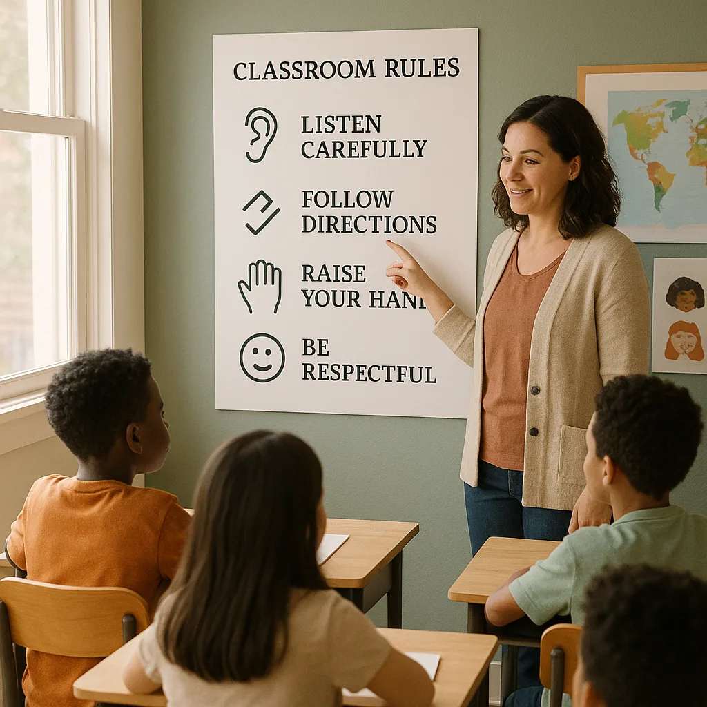
Understanding Processing Differences in the Classroom
Processing differences affect how students perceive, interpret, and respond to visual information. Research shows that approximately 15-20% of students have some form of learning difference, with dyslexia affecting 5-10% and ADHD impacting 5-7% of school-aged children. These students often struggle with traditional text-heavy displays, experiencing increased cognitive load when trying to extract information from cluttered or poorly designed posters.
Moreover, what works for students with processing differences often benefits all learners. This principle of Universal Design for Learning (UDL) means that when we optimize our visual displays for accessibility, we’re actually enhancing comprehension for everyone. Therefore, understanding how to create inclusive poster displays isn’t just about accommodation—it’s about excellence in educational practice.
Additionally, the psychological impact of inclusive design cannot be overstated. When students see visual materials that they can easily process and understand, their confidence grows, anxiety decreases, and engagement naturally follows. This is where having the right Classroom Pro 24 Poster Maker Advanced Package becomes invaluable—it gives educators the tools to create professional, accessible displays on demand.
Poster Maker Printer Inclusive Displays: Font Selection Strategies
Font selection forms the foundation of accessible poster design. Research consistently shows that certain fonts significantly improve readability for students with dyslexia. Sans-serif fonts like Arial, Verdana, and specially designed fonts such as OpenDyslexic reduce letter confusion and improve reading speed.
Key font characteristics that support processing include:
Letter Spacing
1.5x standard spacingWhy It Matters
Increased letter spacing prevents crowding, reducing the likelihood of letters appearing to merge or flip—a common issue for dyslexic readers.Font Size
14-16pt minimumOptimal Range
Larger fonts reduce visual stress and improve character recognition, particularly important for students with visual processing challenges.Character Shape
Distinct letterformsKey Features
Fonts with unique shapes for commonly confused letters (b/d, p/q) significantly improve reading accuracy.When using a poster maker printer, these font considerations become even more critical. High-quality printing ensures that letter shapes remain crisp and distinct, preventing the blurring that can make reading difficult for students with processing differences. The Campus Pro 44 Poster Maker Advanced Package excels at maintaining font clarity even at larger poster sizes.
Color Contrast and Visual Hierarchy
Color plays a crucial role in how students with processing differences interact with visual materials. For students with ADHD, high-contrast color combinations can help maintain attention and reduce visual distractions. Meanwhile, students with dyslexia often benefit from specific color overlays that reduce visual stress.
Effective Color Combinations
Colors to Avoid
• Pure white backgrounds: Can cause glare and visual stress
• Red/green combinations: Problematic for colorblind students
• Low contrast pastels: Difficult for visual processing
• Busy patterns: Create visual noise and distraction
• Fluorescent colors: Can trigger sensory overload
Layout Principles for Reduced Cognitive Load
Effective layout design can dramatically reduce cognitive load for students with processing differences. Research indicates that organized, predictable layouts help students with ADHD maintain focus, while clear visual hierarchies support students with dyslexia in navigating information efficiently.
Essential layout principles include:
1. Consistent Alignment: Left-aligned text is easier to track than centered or justified text for most students with reading difficulties. This consistency provides a predictable starting point for each line.
2. White Space: Generous margins and spacing between elements prevent visual crowding. Aim for at least 30% white space on any poster to give the eyes places to rest.
3. Chunking Information: Break content into small, digestible sections with clear headings. This technique particularly benefits students with ADHD who may struggle with sustained attention.
4. Visual Anchors: Use icons, bullets, or numbering systems consistently to help students navigate information and return to specific points easily.
5. Linear Flow: Arrange information in a clear, top-to-bottom or left-to-right progression that matches natural reading patterns.
Practical Implementation Strategies
Transforming theory into practice requires systematic approaches and the right tools. Here’s how to implement inclusive poster design in your classroom:
Design Checklist
✓ Font size 14pt or larger
✓ Sans-serif typeface selected
✓ High contrast ratio (minimum 4.5:1)
✓ 30% or more white space
✓ Information chunked into sections
✓ Clear visual hierarchy established
✓ Left-aligned text throughout
✓ Consistent use of visual anchors
✓ Matte finish to reduce glare
✓ Tested with target audience
Common Mistakes to Avoid
✗ Decorative fonts that sacrifice readability
✗ All-caps text (harder to read)
✗ Underlining (can obscure letter shapes)
✗ Italics in body text
✗ Centered text blocks
✗ Glossy finishes that create glare
✗ Complex backgrounds or watermarks
✗ Information overload
✗ Inconsistent formatting
✗ Ignoring student feedback
Poster Maker Printer Inclusive Displays: Real Classroom Applications
Let me share some practical examples from schools successfully implementing inclusive poster design. One middle school in Oregon used their poster maker printer to create subject-specific visual anchors with consistent formatting across all classrooms. Students with processing differences reported feeling less anxious when moving between classes because they could quickly locate important information.
Similarly, an elementary school in Texas developed a series of mindfulness posters using calming colors and simple layouts. These posters, created with their Amplify Poster Maker, helped students with ADHD access self-regulation strategies independently.
Furthermore, a high school special education department created customized visual schedules for students with varying needs. By having a poster maker printer on-site, they could quickly adapt these schedules as student needs changed throughout the year, maintaining consistency in design while personalizing content.
Measuring Success and Continuous Improvement
Average improvement metrics after implementing inclusive poster design principles
Success in creating inclusive visual displays isn’t just about following guidelines—it’s about ongoing assessment and refinement. Regular feedback from students with processing differences provides invaluable insights for continuous improvement.
Consider establishing a student advisory group that includes learners with various processing differences. Their perspectives can guide your poster design choices and ensure that your visual materials truly meet diverse needs. Additionally, tracking metrics like assignment completion rates, class participation, and student self-reported confidence levels can help measure the impact of your inclusive design efforts.
Remember, having the best poster printer for schools means nothing without thoughtful implementation. The technology simply enables your inclusive design vision—the real magic happens when you combine quality printing capabilities with evidence-based design principles and genuine commitment to accessibility.