Emergency Safety Posters for Diverse Learners
Find Your Calm: Multi-Sensory Emergency Safety
Creating emergency safety posters that work for every learner isn’t just about compliance—it’s about compassion. When we use a poster maker for schools emergency safety protocols, we’re building bridges to understanding that can literally save lives. Let me share how visual tools transform safety preparation into an inclusive experience that honors every student’s unique way of processing information.
Understanding the Poster Maker for Schools Emergency Safety Connection
In my years working with schools across the country, I’ve witnessed a profound truth: safety isn’t one-size-fits-all. Research from the National Center for Learning Disabilities shows that approximately 1 in 5 students have learning and attention differences. Additionally, the U.S. Department of Education reports that over 5 million English Language Learners attend our schools. These statistics underscore why traditional emergency drill procedures often fall short.
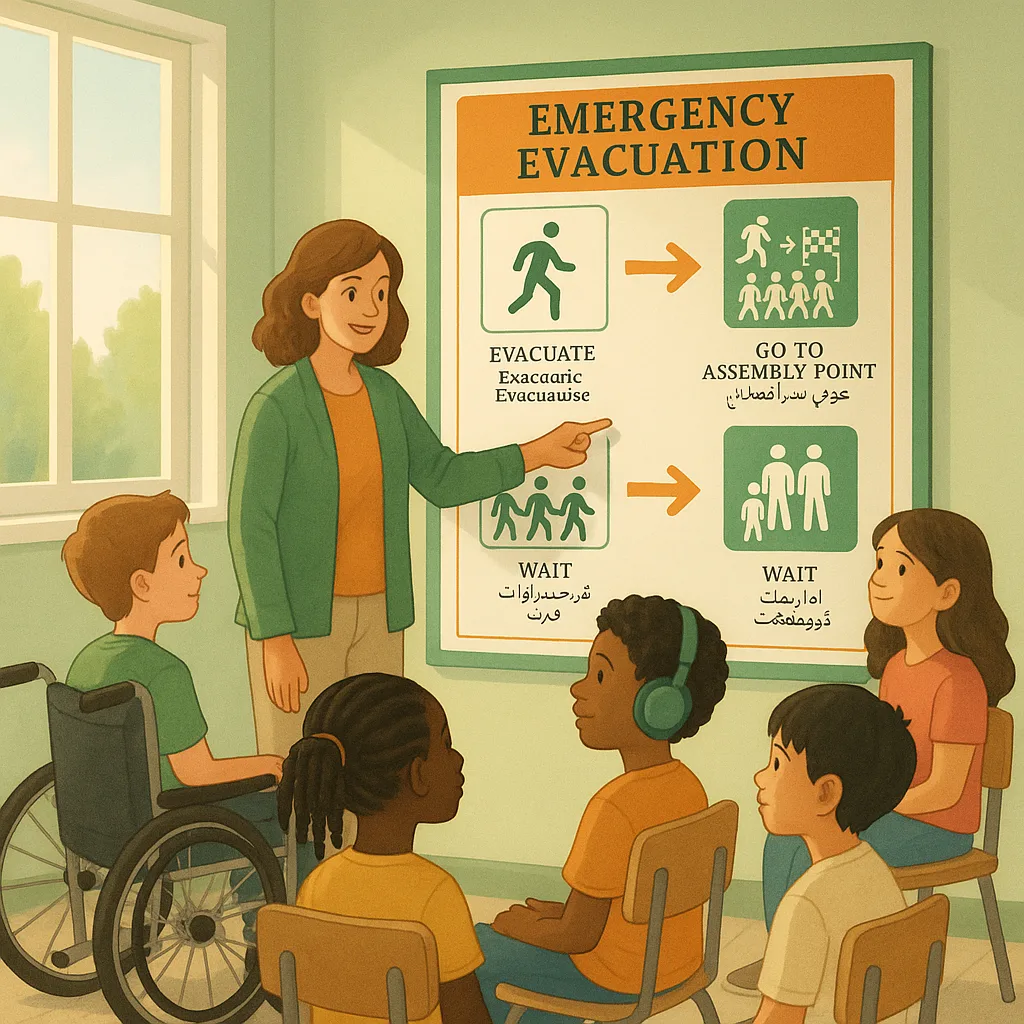
Think about your typical fire drill poster. Usually, it’s a text-heavy document with small print and complex instructions. For a student with dyslexia, processing delays, or limited English proficiency, that poster might as well be written in code. This is where a thoughtfully used poster printer machine becomes a tool for equity and inclusion.
The beauty of creating custom emergency posters lies in their flexibility. Unlike pre-made signs, you can design displays that speak to your specific student population. Whether you’re supporting students with autism who need visual schedules, English learners who benefit from pictorial representations, or students with anxiety who require calming visual cues, your poster maker becomes an instrument of universal design.

Creating Your Multi-Sensory Safety Poster System
Let me walk you through creating an inclusive emergency poster system that truly serves all learners. This isn’t about making your existing posters “prettier”—it’s about reimagining how we communicate critical safety information.
Step 1: Assess Your Diverse Learner Needs
Before you even turn on your poster maker for schools, take inventory of your student population. Work with your special education team, ESL coordinators, and school counselor to understand:
• The range of disabilities present in your school
• Primary languages spoken by families
• Sensory processing considerations
• Trauma-informed care requirements
• Cultural considerations around emergency responses
This assessment forms the foundation of your design strategy. For instance, if you have students with autism, you’ll want to avoid bright, flashing colors that might trigger sensory overload. If you serve a large Spanish-speaking population, bilingual elements become essential.
Step 2: Design with Universal Principles
When creating your posters, apply these evidence-based design principles:
Visual Hierarchy: Use size and color to guide attention. The most critical information (like exit routes) should be the largest and most prominent.
Symbol Systems: Incorporate universally recognized symbols alongside text. The International Organization for Standardization (ISO) provides guidelines for safety symbols that transcend language barriers.
Color Coding: Develop a consistent color system. For example:
– Green for safe zones and exit routes
– Red for danger areas or fire equipment
– Blue for shelter-in-place locations
– Yellow for caution areas
Contrast and Clarity: Maintain high contrast between text and background. The Web Content Accessibility Guidelines (WCAG) recommend a contrast ratio of at least 4.5:1 for normal text.
Emergency Drill Success Statistics
Student comprehension rates improve dramatically with multi-sensory emergency posters
Step 3: Incorporate Tactile Elements
Here’s where your creativity with a poster printer machine really shines. While we can’t make every poster fully tactile, we can create visual representations of texture that prepare students for what they’ll encounter:
• Use raised printing effects or textured overlays for exit paths
• Create Braille labels using clear adhesive sheets
• Add velcro strips for removable picture cards
• Include QR codes that link to audio instructions
One particularly effective technique I’ve seen is creating “touch and go” stations along evacuation routes. These posters have textured arrows that students can follow with their hands, providing both visual and simulated tactile guidance.
Step 4: Address Language and Cultural Diversity
Multilingual safety posters aren’t just translated text—they’re culturally responsive communication tools. When designing for linguistic diversity:
• Place pictographs first, with text as secondary support
• Use simple, active voice commands (“Walk to Exit” not “Proceed to the designated evacuation point”)
• Include the top 3-5 languages spoken in your school
• Consider cultural interpretations of symbols and colors
Remember, some cultures read right to left, which affects how you design directional elements. Working with parent volunteers from different cultural backgrounds can provide invaluable insights.
Specific Adaptations for Different Needs
Let me share specific adaptations that have proven successful in schools I’ve worked with:
For Students with Autism Spectrum Disorder:
• Use consistent visual symbols throughout the building
• Create social stories as poster series showing each step
• Avoid overwhelming patterns or busy backgrounds
• Include “first-then” visual schedules for drill procedures
For Students with Visual Impairments:
• High contrast color combinations (black on yellow is optimal)
• Large, bold fonts (minimum 24-point for important text)
• Tactile elements where possible
• Audio QR codes placed at consistent heights
For Students with Intellectual Disabilities:
• Simple, one-step instructions per visual
• Photograph-based directions rather than illustrations
• Repetitive visual cues along evacuation routes
• Buddy system visual reminders
For English Language Learners:
• Universal pictographs as primary communication
• Native language translations for key terms only
• Color coding that transcends language
• Cultural symbol considerations
Training and Professional Development
Creating inclusive safety posters is just the first step. Staff training ensures these visual tools achieve their full potential. Here’s a professional development framework I’ve successfully implemented:
Phase 1: Awareness Building
Help staff understand the diverse learning needs in your building. Share anonymized profiles of different learner types and how they process emergency information differently.
Phase 2: Poster Familiarization
Walk through each poster element with staff, explaining the reasoning behind design choices. This helps teachers reinforce the visual messages during non-emergency times.
Phase 3: Practice Integration
During regular drill practices, have staff observe how different students interact with the posters. Document what works and what needs adjustment.
Phase 4: Continuous Improvement
Create a feedback loop where teachers, students, and parents can suggest improvements to your safety poster system.
I remember working with a school in Arizona where 40% of students were English Language Learners, and several students had significant sensory processing challenges. Initially, their emergency drills were chaotic and anxiety-inducing. After implementing a comprehensive multi-sensory poster system, their drill times improved by 3 minutes, and more importantly, student stress levels decreased dramatically. One teacher told me, “For the first time, I saw my student with autism calmly follow the evacuation route by touching each poster along the way. It was like watching him find his own path to safety.”
Measuring Success and Impact
How do you know if your multi-sensory safety posters are working? Here are evidence-based metrics to track:
• Drill completion times: Document how quickly students evacuate before and after implementing new posters
• Student surveys: Use simple pictograph surveys to gauge understanding
• Behavioral observations: Note instances of confusion or anxiety during drills
• Staff feedback: Regular check-ins with teachers about student responses
• Parent communication: Share your safety poster system with families for home reinforcement
Remember, success isn’t just about faster evacuation times—it’s about every student feeling confident and capable during emergency situations.
A Final Thought on Inclusive Safety
Creating inclusive emergency safety posters isn’t just about compliance or preparedness—it’s about affirming every student’s right to feel safe and informed. When we use our poster maker for schools emergency safety protocols with intention and creativity, we’re sending a powerful message: every student matters, every learning style is valid, and everyone deserves to understand how to stay safe. That’s the kind of inclusive environment where all students can thrive, even in challenging moments.