Poster Making Machine for School Safety Success
From Concept to Display: Visual Safety That Works
Creating effective school safety protocols requires more than just rules—it demands visual communication that resonates with students. When you invest in a poster making machine safety protocols approach, you’re building a culture where safety becomes second nature, not just another set of forgotten guidelines posted on hallway walls.
Understanding the Psychology Behind Safety Poster Compliance
As educators, we’ve all witnessed the phenomenon: carefully crafted safety posters that students walk past without a second glance. However, research in educational psychology reveals that visual processing accounts for 65% of how students learn and retain information. This statistic becomes even more powerful when applied to safety protocols, where split-second recognition can make all the difference.
The key lies in understanding how young minds process visual information differently across developmental stages. Elementary students respond to bright colors and character-based messaging, while middle schoolers connect with peer-oriented visuals and relatable scenarios. Meanwhile, high school students engage most with sophisticated designs that respect their maturity while clearly communicating expectations.
Age-Appropriate Design Strategies
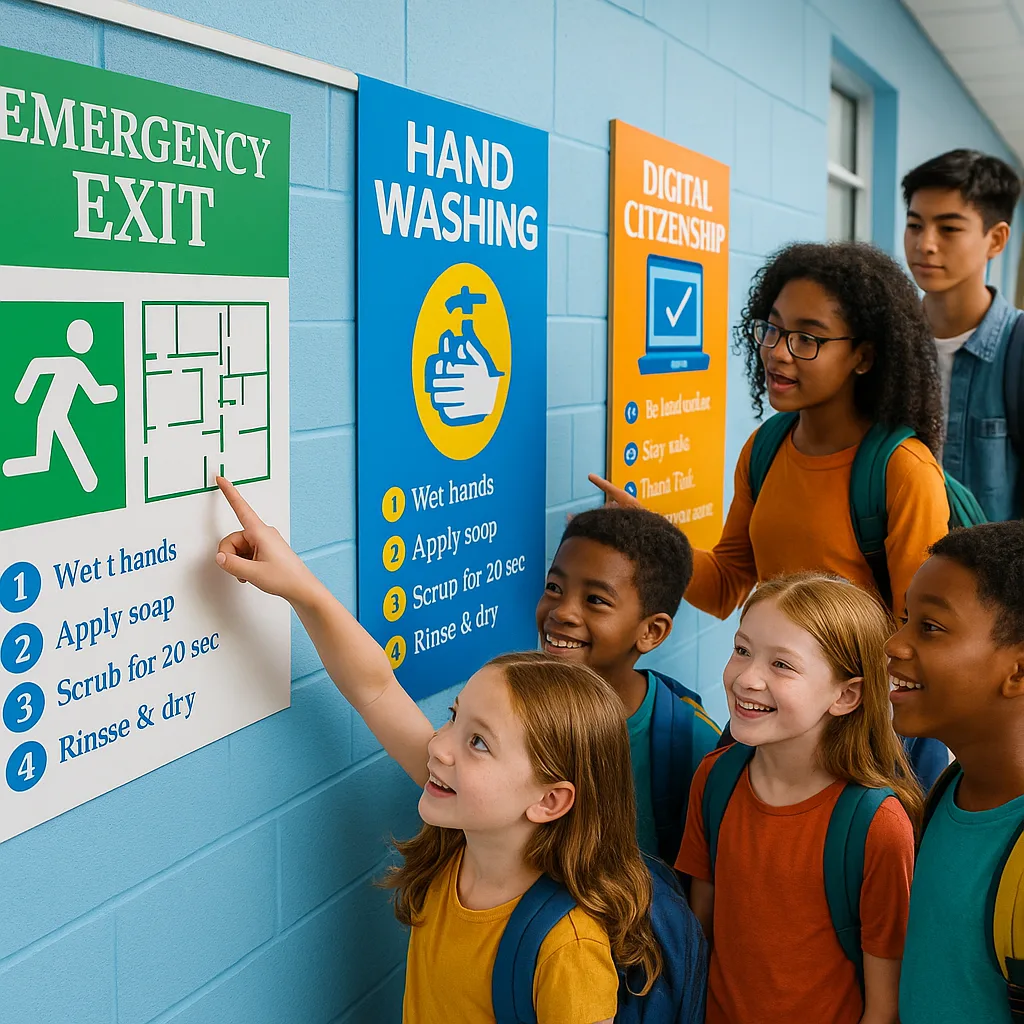
 demonstrating proper emergency exit procedures. The poster uses primary colors")
Elementary (K-5)
• Bright primary colors
• Character mascots
• Simple icons and symbols
• Rhyming safety phrases
• Picture-based instructions
Middle School (6-8)
• Bold, modern designs
• Peer-focused messaging
• Infographic elements
• Action-oriented language
• QR codes for engagement
High School
Click for strategiesDesign Tips
• Sophisticated layouts• Data-driven content
• Minimalist aesthetics
• Social proof elements
• Mobile-friendly QR links
Strategic Placement: Making Every Poster Count
Location dramatically impacts poster effectiveness. Research indicates that strategically placed safety visuals increase compliance by up to 78%. Consider these high-impact zones when planning your safety poster campaign:
Primary Visibility Zones:
Essential Design Elements for Maximum Impact
Professional designers follow specific principles when creating safety communications. With your school poster maker, you can implement these same strategies:
Visual Hierarchy Principles
1. The 3-Second Rule: Your primary safety message must be understood within three seconds of viewing. Use large, bold headlines that communicate the core action required.
2. Color Psychology: Red signals immediate danger, yellow indicates caution, and green represents safe practices. However, overusing red can create alarm fatigue.
3. White Space Management: Cluttered posters overwhelm students. Maintain 30-40% white space to ensure messages breathe and capture attention.
Typography That Commands Attention
Font Selection: Sans-serif fonts like Arial or Helvetica ensure readability from distances. Avoid decorative fonts that compromise clarity.
Size Matters: Headlines should be readable from 20 feet away. Body text requires 10-foot readability for effective corridor placement.
Contrast Ratios: Maintain a minimum 7:1 contrast ratio between text and background colors to ensure accessibility for all students, including those with visual impairments.
Transform Your School’s Safety Culture Today
Creating effective visual safety protocols isn’t just about compliance—it’s about building a culture where every student feels informed, empowered, and protected. When you invest in a poster making machine safety protocols system, you’re investing in your school community’s wellbeing. Start small with pilot programs in high-priority areas, then expand based on proven success. Remember, the most effective safety communications are those created with student input and regularly updated to maintain relevance.