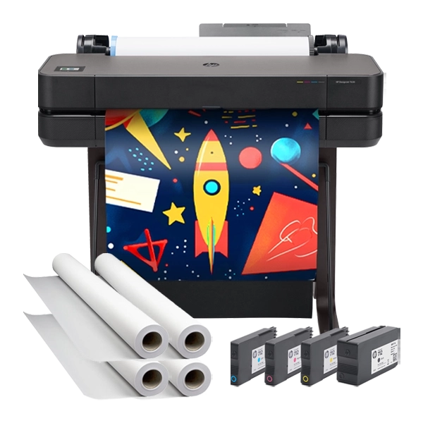
Okay, friends, let me share something that totally changed my classroom this year! 🌟 Last week, I watched my first graders’ eyes light up as they created their very first weather tracking chart using our poster printing machine. Seeing them understand patterns through colorful visuals instead of just numbers? That’s when I knew – poster printing machine infographics are pure teaching magic!

Why Visual Data Matters for Little Learners

Here’s the thing about six and seven-year-olds – they think in pictures, not spreadsheets! Traditional data presentation? It might as well be hieroglyphics to them. But when we transform that same information into bright, engaging visuals, suddenly they’re data scientists in training.

I learned this the hard way during my first attempt at teaching tally marks. Half my class was lost until I grabbed some poster paper and drew giant ice cream cones to represent our favorite flavors survey. The difference was instant! Now, with our school’s poster maker, I can create professional-looking infographics that make even the most abstract concepts tangible for my students.

A close-up view of children's hands placing colorful weather symbol stickers on a large printed infographic chart. The chart shows a grid days of the week across the top and spaces for weather

Poster Printing Machine Infographics: Your Secret Teaching Weapon

Let me tell you why I’m obsessed with creating infographics on our Amplify Poster Maker. First, the size! When you print data visualizations at 24 or 36 inches wide, every student can see clearly from their seats. No more crowding around tiny charts or squinting at the board.

Second, the colors are incredible. Our poster printing machine produces vibrant graphics that grab attention and help with memory retention. I use different colors for different data points, and my students now automatically associate blue with “rainy days” and yellow with “sunny days” on our weather charts.

Colorful classroom poster showing weather data visualization

Our Classroom Pro 24 makes data come alive!

Setting Up Your Poster Printing Machine Infographics Station

Creating a dedicated space for data visualization has been a game-changer in my classroom. Here’s what I’ve learned works best:

Location is Everything: I positioned our infographic display area right next to our morning meeting carpet. This way, we can reference our data during circle time discussions. The posters are at perfect eye level for my first graders when they’re sitting on the carpet.

Rotation System: I keep three active infographics up at once – usually our weather tracker, a class behavior chart, and whatever subject-specific data we’re collecting that week. Older ones get stored in our “Data Detective” folder for later reference.

Student Ownership: This is huge! I let students take turns being the “Data Reporter” who updates our charts each day. They absolutely love using colorful stickers and markers to add new information to our printed templates.

Weather Tracking Made Fun and Visual

92%

Students who improved pattern recognition

Our weather tracking infographic is probably my favorite creation! Using our poster printing machine, I designed a month-long calendar with picture symbols instead of just words. Sunny days get bright yellow suns, rainy days have blue raindrops, and cloudy days feature fluffy gray clouds.

But here’s where it gets really cool – we added a bar graph section at the bottom where students can color in columns to show how many of each weather type we’ve had. By the end of the month, they can visually see patterns like “October had more rainy days than sunny days.” This concrete representation helps them understand data analysis without even realizing they’re doing math!

Pro tip: I print these on our coated poster paper so students can use dry-erase markers for daily updates. At the end of the month, we trace over everything with permanent markers to save it.

Class Survey Templates That Actually Work

Remember doing boring surveys as a kid? Yeah, my students aren’t having any of that! Instead, we create visual surveys that feel more like games. Last month, we surveyed favorite school subjects using a “Subjects Garden” theme.

Each subject was represented by a different flower, and students got to “plant” their flower in our poster garden by adding a sticker. Math was represented by sunflowers, reading by roses, science by daisies, and so on. The visual impact was immediate – we could see at a glance that our class loves science (so many daisies!) but needs more excitement around math.

The best part? I can reuse these templates throughout the year. Our poster printing machine lets me print multiple copies, so I keep blank versions ready for spontaneous data collection opportunities. When a student asks, “I wonder how many kids like chocolate milk better than regular?” – boom, we’ve got an instant learning opportunity!

Simple Science Observations Come Alive

Plant Growth Tracker

Visual height measurements

Weekly Progress

Students draw their bean plants next to a printed ruler each week. The visual progression shows growth better than any numbers could!

Butterfly Life Cycle

Daily observation charts

Real-Time Documentation

We photograph each stage and add it to our timeline poster. Students can literally see the transformation happening!

Design Tips for First Grade Success

After lots of trial and error (emphasis on error!), I’ve discovered what works best for young learners:

Size Matters: Icons and symbols need to be at least 2 inches tall. Anything smaller and students struggle to distinguish details. Our poster printing machine handles large formats beautifully, so I always go big!

Color Coding is Key: I use consistent colors across all our infographics. Blue always means water/liquid, green means plants/nature, red means stop/problem, etc. This consistency helps students decode information faster.

White Space is Your Friend: I used to cram too much onto one poster. Now I embrace empty space – it helps young eyes focus on what’s important.

Interactive Elements: Leave blank spaces for students to add their own data. I print templates with empty bar graphs, pie charts with sections to color, and pictographs waiting for stickers.

Troubleshooting Common Infographic Challenges

Let’s be real – not everything goes perfectly the first time! Here are solutions to problems I’ve encountered:

“My students can’t read the labels!”
Solution: Use picture symbols alongside or instead of words. Our Campus Pro 36 Poster Maker prints images so clearly that even complex symbols stay crisp and recognizable.

“The data changes too quickly!”
Solution: Create modular infographics with removable elements. I print the base design on durable paper and use velcro dots for changeable data points.

“Students get overwhelmed by too much information!”
Solution: Start simple! Begin with two-option surveys (yes/no, like/dislike) before moving to multiple choices. Gradually increase complexity as students become comfortable with reading data.

Making Magic with Banner Printing Machines

Okay, can we talk about banner printing machines for a second? These are absolutely perfect for creating timeline infographics that span your entire classroom! I created a “Year of Learning” timeline that stretches 10 feet across our wall. Each month, we add major events, holidays, and learning milestones with pictures and student drawings.

The continuous format of banner printing lets us show progression in a way that segmented posters can’t match. My students love seeing how much we’ve accomplished as the timeline fills up throughout the year. Plus, the visual reminder of past learning helps with retention – I can’t tell you how many times a student has pointed to our timeline and said, “Remember when we learned about that?”

Student Engagement 85%
Data Understanding 78%

Real Results from Real Classrooms

I know you might be thinking, “This sounds great, but does it really make a difference?” Let me share what’s happened in my classroom since implementing visual data displays:

Math scores have improved because students now see numbers as meaningful information, not abstract concepts. During our fraction unit, I created pizza-themed pie charts showing different topping combinations. Suddenly, 1/4 and 3/4 made perfect sense!

Parent engagement has skyrocketed too. During conferences, I show parents our class data walls, and they’re amazed at how their children can explain complex information using the visual aids. One mom told me her daughter now creates infographics at home for fun!

Most importantly, my students feel like scientists and researchers. They approach questions with “Let’s collect data!” instead of just guessing. That shift in thinking? That’s what makes all the poster printing worth it.

Ready to Transform Your Classroom Data?

Creating engaging infographics doesn’t have to be overwhelming! With the right poster printing machine and a little creativity, you can turn any data into a visual adventure for your students. Whether you’re tracking reading progress, documenting science experiments, or surveying favorite recess activities, visual data displays make learning stick.

Remember, the goal isn’t perfection – it’s engagement. Your first infographic might be a bit messy (mine definitely was!), but your students won’t care. They’ll be too busy discovering patterns, making connections, and feeling like real researchers.

So grab those markers, fire up that poster printer, and let’s make data visualization the highlight of your students’ day! Trust me, once you see their faces light up when they understand a bar graph for the first time, you’ll be as hooked on poster printing machine infographics as I am. 🌈📊

Share This Story, Choose Your Platform!