School Poster Printers Event Guide for New Teachers
Design Principles That Actually Work
After creating approximately seventeen versions of my first poster (okay, maybe it was more like twenty-three), I’ve learned that good design isn’t about being fancy – it’s about being clear. Think of your poster as a friendly conversation with parents and students, not a formal announcement.
Color choices matter more than you think! For my fall carnival poster, I started with orange and black (classic autumn, right?). But then I remembered our school colors are blue and gold. Mixing seasonal themes with school branding created something that felt both festive and official. Pro tip: stick to 3-4 colors maximum – your eyes (and your printer) will thank you.
Font selection is your secret weapon. I learned this the hard way when my beautifully scripted “Winter Wonderland Dance” poster looked more like “Winter Wonderbread Lance” from across the hallway. Now I stick to clean, readable fonts for important information and save the fancy stuff for titles only.

Using School Poster Printers Event Creation Templates
Templates aren’t cheating – they’re smart! Think of them as training wheels that help you understand good design principles while still allowing for creativity. I’ve created a simple system using our poster design software that’s saved me countless hours.
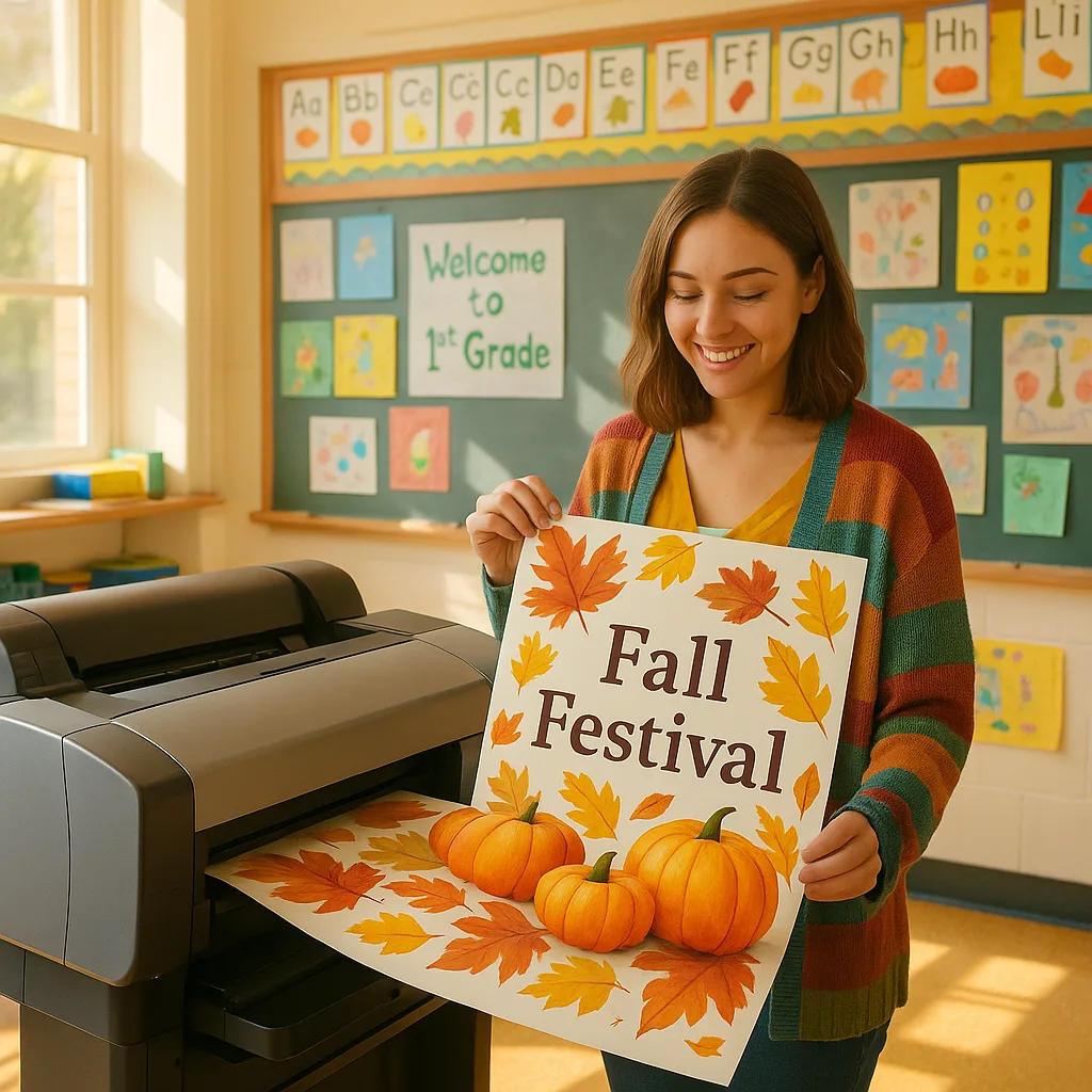
For general events, I start with a three-zone layout: header (event name and eye-catching graphic), body (key details in order of importance), and footer (contact info and school logo). This structure works for everything from book fairs to talent shows. The beauty of using quality poster paper is that your designs always look professional, even when you’re still learning.
Troubleshooting Common First-Timer Mistakes
Oh boy, do I have stories about poster printing mishaps! Learning from my mistakes (so you don’t have to repeat them) has become something of a personal mission. Here are the biggies I’ve encountered and how to avoid them.

Making Your Posters Stand Out
The secret to posters that actually get noticed? It’s not about being the loudest or the brightest – it’s about being memorable and clear. I learned this during our winter book fair when my elaborately designed poster got less attention than Mrs. Johnson’s simple but bold design next door.
Consider your poster’s location when designing. Hallway posters need to be readable from 10 feet away, while classroom door posters can include more detail. For outdoor events, remember that weather-resistant inks are your best friend – learned that one during a particularly rainy field day!