School Poster Printers Image Resolution Guide
DPI: The Magic Number
DPI stands for “Dots Per Inch,” and it’s basically how many tiny dots of color fit into one inch of your printed poster. For crisp classroom posters, you’ll want:
• 150 DPI minimum for posters viewed from a few feet away
• 300 DPI for super sharp prints (like reading posters)
• 72-100 DPI might work for huge banners viewed from far away
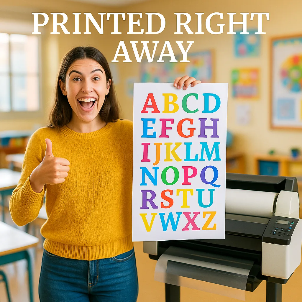
Here’s my trick: I always aim for 300 DPI when I can. Better to have too much quality than not enough!
 in three different resolutions. Left panel labeled “72 DPI” shows a pixelated, blurry version.")
JPEG/JPG
Best For Photos
Perfect for photographs and complex images. Most smartphones save photos as JPEGs!PNG
Best For Graphics
Great for logos, text, and graphics with transparent backgrounds. My go-to for clipart!Best For Documents
Excellent for text-heavy posters and maintaining quality. Works great with poster design software!Here are my top tips for using phone photos with your poster printer machine:
1. Check your camera settings – Make sure you’re shooting at the highest quality
2. Good lighting is everything – Natural light near a window works wonders
3. Hold steady – Blurry photos = blurry posters
4. Don’t zoom in too much – Digital zoom reduces quality
5. Clean your lens – A quick wipe makes a huge difference!
Last week, I created stunning student spotlight posters using nothing but iPhone photos. The parents were amazed at the quality!
P.S. – Don’t forget to save this guide! I keep a printed copy right next to our school poster printers as a quick reference. And if you’re looking for more tips on making the most of your poster maker, check out the comparison guide to see why teachers love these machines. Happy printing, friends! 🎨✨