School Poster Printers Satin Vs Matte Guide

Key Findings from Our Testing
The results revealed some fascinating insights that can help you make informed decisions when using poster printers for schools:
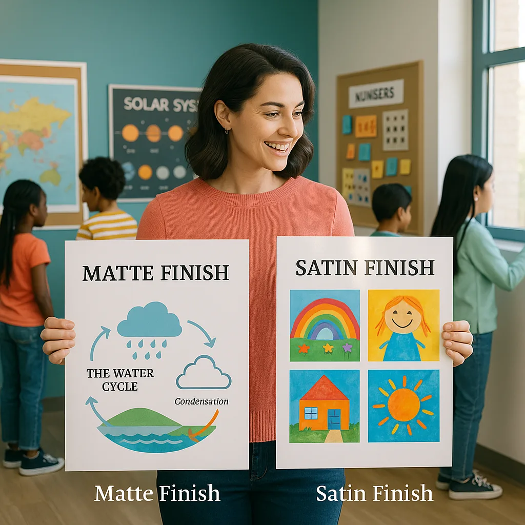
Matte Paper Performance:
• 85% readability score in bright/direct light conditions
• Zero glare complaints from students
• Colors appeared slightly muted but text was crystal clear
• Perfect for text-heavy content like anchor charts and rubrics
• Fingerprints and smudges less visible
Satin Paper Performance:
• 72% visual appeal score across all lighting conditions
• Enhanced color vibrancy made graphics pop
• Slight glare issues near windows (manageable with proper placement)
• Ideal for image-heavy posters and student artwork displays
• More durable against moisture and handling
Classroom Lighting: The Game Changer
Understanding your classroom’s lighting situation is crucial when choosing between paper finishes. Let me share what we’ve learned!
Durability Deep Dive: Which Finish Lasts Longer?
Satin paper moisture resistance after 6 months of classroom use
Matte paper edge integrity after daily handling
Both finishes color retention with quality inks
Advanced Tips from the Trenches
After years of poster-making adventures (and yes, a few mishaps), here are my insider tips for getting professional results every time:
The Hybrid Approach:
For complex posters with both text and images, consider printing on satin but using matte lamination. This gives you the color vibrancy of satin with the glare reduction of matte—best of both worlds!
Test Strip Method:
Before committing to a full-size poster, print 6-inch test strips on both finishes. Tape them up in your intended display location and check them at different times of day. This small investment of paper can save you from reprinting large posters.
Seasonal Considerations:
In my experience, matte works better for fall/winter displays when natural light is limited, while satin shines (literally) for spring projects when classrooms are brighter. Plan your paper orders accordingly!
The Student Voice:
I always involve my students in finish selection for collaborative projects. They often notice things we miss—like how satin makes their artwork feel more “professional” or how matte is easier to photograph for their digital portfolios.