What Makes a Great Poster for K‑12 Classrooms?
Designing an effective classroom poster is both an art and a science. Teachers in K‑12 classrooms use posters not only to decorate, but to reinforce learning and inspire students. With modern tools like School Poster Makers, creating high-quality educational posters has never been easier or more accessible for educators. The key question is: What Makes a Great Poster for K‑12 Classrooms? In this guide, we’ll explore how posters enhance visual learning, the design principles behind impactful posters, tips for different grade levels, and how top-of-the-line tools (like the Classroom Pro and Campus Pro series) can help bring your poster ideas to life.
The Role of Posters in Visual Learning and Classroom Engagement
Posters Create a Positive and Engaging Learning Space
A bright, welcoming poster can instantly set a positive tone. Simple, encouraging messages help students feel included and valued. Friendly designs—with warm colors or fun illustrations—make the room feel inviting.
Posters do more than decorate. They’re powerful visual aids. Research shows the brain processes images faster than words. This helps students remember concepts better. Posters support comprehension, focus, and long-term memory.
Placed strategically, a poster can become a focal point. Bright colors and bold text naturally draw the eye. When students notice a poster, they’re more likely to engage with it. Over time, these visuals become passive teaching tools. A motivational quote or key process—like the scientific method—stays top-of-mind because it’s always in view.
Posters Support Student Learning and Classroom Culture
Great posters do more than teach—they also inspire. They can reflect classroom values, support behavior expectations, or showcase student work. These displays help students feel seen and supported.
When posters are purposeful, they become part of daily instruction. A teacher might point to a “sentence starters” poster during a discussion. This simple move encourages students to participate. Posters like these act as quiet teaching assistants on the wall.
They also support different learning styles. Not every student learns best through reading or lectures. Visual learners often thrive with posters, charts, or diagrams. Including these tools makes your classroom more inclusive.
When used well, posters give every student a clear and consistent visual path to understanding.
Key Principles of Effective Educational Poster Design
Designing a poster for maximum impact requires careful attention to design principles. A great poster balances visual appeal with clear communication. It should attract students with its look but also convey information effortlessly. As one design guide puts it, a good poster features a “clear, uncluttered design” with a touch of color, and it avoids overwhelming viewers with too much text. In this section, we break down the core elements – from typography and color choices to layout and graphics – that contribute to an effective poster.
Clarity and Readability
Keep It Clear and Easy to Read
In the classroom, clarity is everything. Students should be able to read a poster from across the room—no guessing, no squinting.
Stick to short, simple phrases. Focus on one idea per poster. Don’t overload it with too much text.
Experts suggest your key message should be readable from 10 feet away. That means using large font sizes—at least 30 points for body text. Your title should be even bigger and bold.
Use fonts that are easy to read. Clean, sans-serif fonts like Arial or Helvetica work best. Avoid fancy or cursive fonts. They look nice up close but are hard to read from a distance.
Use Font and Layout to Guide the Eye
Consistency helps posters feel polished. Stick to two font styles max—one for headings and one for body text.
Use bold and italics sparingly. Highlight only what matters most. Overuse makes everything blend together.
Create a visual hierarchy with size and weight. The title should be the largest. Headings should come next, then supporting details.
Break up big blocks of text. Use bullet points, lists, or keywords instead of full sentences. This makes your poster faster to scan.
If you need to share a lot of info, split it across multiple posters or add a handout. One crowded poster won’t be effective.
Bottom line: clear layout, simple fonts, and a focused message are the keys to a poster that actually works.
Color Choices and Contrast
Choose a Simple, Purposeful Color Palette
Color is one of the first things people notice about a poster. The right color choices can make your poster visually appealing and enhance learning.
Start by limiting your palette. The perfect poster for K–12 classrooms typically uses just two to four complementary colors. Using too many colors—like every shade of the rainbow—can create a chaotic and distracting look.
Instead, stick to a consistent scheme. You might use your school colors or select hues that match the poster’s topic. For example, a poster about plant life cycles could use greens and browns for a nature-inspired look.
Consistency in color brings unity to the design and makes important elements stand out more clearly.
Use Contrast and Color Psychology to Enhance Learning
Good contrast is just as important as good color choices. Always ensure that text stands out from the background. Dark text on a light background—or light text on a dark background—is usually the most readable.
Black or navy text on pale backgrounds works well, while yellow on white is nearly impossible to read from a distance. If you’re using a bright background color, place the text on a white overlay or high-contrast shape to maintain readability.
Always test your poster by stepping back a few feet. If the text or images are hard to read, tweak your contrast or color balance until they’re clear.
Color also affects mood and attention. Warm colors like red, orange, and yellow grab attention and energize young students—perfect for elementary classrooms and creative subjects. Cool tones like blue, green, and purple have a calming effect and work well in upper grades where focus and relaxation are key.
Age plays a role in color preference. Younger children love bright, bold hues. Teens often prefer cooler, more subdued tones—though they still enjoy color if it doesn’t feel too juvenile.
One high school teacher found that students actually appreciated how colorful her room was. It made them feel happier and more connected to the space.
The takeaway? Choose colors that fit your students and the atmosphere you want to create. A few bold accents can go a long way. Just be careful not to overdo it—too many intense colors can become overwhelming or even heighten anxiety.
Balance bright accents with neutral or soft tones to create a visually appealing and student-friendly learning environment.
Layout and Visual Hierarchy
Organize Your Poster with Clear Sections and Ample White Space
The layout of your poster plays a crucial role in how easily students can absorb the information. A well-organized layout presents content in a logical flow and guides the viewer’s eye from one element to the next.
To achieve this, divide your poster into clear sections or zones. For example, place a bold heading at the top, a central image in the middle, and supporting bullet points or facts near the bottom. Subheadings for each section can further clarify what the viewer is looking at.
If your content covers multiple topics, consider using separate posters instead of squeezing everything into one crowded design. Less clutter means better comprehension.
White space—or empty space—is a valuable design tool. Avoid the temptation to fill every inch with text and visuals. A cluttered poster can overwhelm students and reduce readability.
Design experts recommend leaving around 30% of your poster as white space between text blocks and images. This breathing room allows the viewer to focus and absorb key information more effectively.
The same principle applies to your classroom walls. Even in early education settings, not every surface should be covered. One guideline suggests keeping 20–50% of wall space clear to avoid overstimulating young learners.
When in doubt, simplify. Removing excess elements often improves the overall effectiveness of your poster.
Use Alignment and Visual Hierarchy to Guide the Eye
Alignment and flow are just as important as what your poster says. Make sure all text boxes, headings, and images are arranged neatly—either centered or aligned to one side—for a polished, professional look.
Poor alignment can confuse students about where to look next. Most readers naturally scan from top to bottom and left to right, so structure your content accordingly. Place key messages near the top or in the center.
If your poster shows a sequence, such as steps in a process, use numbers, arrows, or connecting lines to show the correct reading order. This helps the eye move effortlessly from one point to the next.
A great example of this is a poster that uses bold headings, numbered points, and icons to create a clear visual path. The design doesn’t just deliver information—it leads the viewer through it step by step.
This is where visual hierarchy becomes essential. Visual hierarchy means some elements appear more prominent than others to show their importance. Larger titles, bold section headings, and smaller bullet points are all part of this design strategy.
You can also use placement and color to emphasize key ideas. For instance, a central image or a splash of color behind an important word can immediately draw attention.
Use these design techniques sparingly and intentionally. Not everything should fight for attention. Your goal is to make the main message obvious and allow students to naturally move on to supporting details.
By thoughtfully combining alignment, spacing, and emphasis, your layout becomes more than decoration—it becomes a silent teacher, guiding students through your content with ease.
Using Images and Graphics
Use Images to Reinforce and Clarify Key Concepts
A picture is worth a thousand words—especially for younger or visual learners. Great classroom posters often include images, icons, or illustrations that reinforce the core message.
Graphics help make abstract concepts more concrete and break up text-heavy content. For example, a science poster explaining the water cycle might feature a simple diagram with brief text descriptions beside each stage.
When adding images, make sure they directly support the topic. The best visuals clarify or illustrate the concept you’re teaching. A well-chosen diagram or chart can often communicate in one glance what would take several sentences to explain.
Pairing visuals with text improves comprehension, especially for complex ideas. This combination helps students absorb and retain information more effectively.
Prioritize Image Quality, Layout, and Student Involvement
Image quality matters. Always use high-resolution images so your poster prints sharp and professional. Low-res images can appear blurry or pixelated—especially on large formats.
If an image contains small details like labels or icons, make sure those elements are visible from a few feet away. A simple test: print it on a regular sheet of paper. If it looks clear, it should scale well for a poster.
Most poster printers recommend using 300 DPI (dots per inch) for optimal print clarity. Also, respect copyright and privacy—use royalty-free or public domain graphics, and avoid using student photos without permission if the poster will be displayed publicly.
When designing your layout, integrate visuals with intention. Wrap text around images or use captions if necessary. Keep the balance: images should complement the content, not overwhelm it.
Limit each poster to one or two strong visuals—such as one main illustration and maybe a small icon or logo. Too many images compete for attention and create visual clutter.
Student-created visuals are a powerful addition. Encourage students to contribute drawings or class project photos. For example, a timeline of historical events could feature student artwork for each milestone.
Including student input not only makes posters more relatable—it fosters a sense of pride and ownership. These collaborative designs can become lasting learning tools that students feel connected to.
Tips for Designing Posters by Grade Level
Not all posters are one-size-fits-all. The most effective poster for a first-grade classroom will look quite different from one made for high schoolers. Students’ developmental stages, interests, and attention spans evolve as they grow, so it’s important to tailor your poster design approach to the age group you’re teaching. Below are some grade-specific tips to help you create classroom posters that resonate with elementary, middle, and high school students respectively.
Posters for Elementary Classrooms (K–5)
In elementary classrooms, posters should be fun, lively, and highly visual. Younger students are attracted to posters that are colorful and friendly in appearance. Don’t hesitate to use bright, warm colors – yellows, reds, oranges – which younger children naturally gravitate toward. These colors can energize and excite early learners, making the classroom feel like a vibrant, welcoming place. For example, a poster teaching the alphabet might feature each letter in a different bold color with cheerful illustrations.
Keep text very simple for this age group. Many K–2 students are beginning readers, so they benefit from posters that use large letters and as few words as possible. Pictures and symbols can often convey meaning better than text for younger kids. Consider using visuals like icons or cartoons to represent concepts (e.g. a cartoon clock for a “telling time” poster). If you include text, use basic vocabulary and short phrases. Fonts should be extremely clear – a primary-style font or simple bold sans-serif works well so that children can even practice reading from the poster. Also, ensure your posters are hung at an appropriate height (eye-level for your students), so they can actually see and interact with them.
An important tip for elementary posters is to make them interactive or referenceable in daily routines. For instance, you might have a calendar poster, a weather chart, or a “word of the day” poster that you update together with the class. These not only decorate the room but become part of learning activities. **Anchor charts** (teacher-made posters developed during a lesson) are extremely popular in elementary grades – for example, a chart of “Writing Rules” or a list of strategies for solving math problems, co-created with student input. Such posters are teaching tools that you can point to when reviewing concepts. Young children will rely on these visual reminders, especially as they build foundational skills.
One caution: avoid overstimulating little ones with too much on the walls. While color and visuals are great, a room plastered with dozens of posters can be distracting for kindergartners. It’s a good idea to introduce posters gradually and take down or rotate out those that aren’t currently relevant. As noted earlier, leaving some blank space on the walls (potentially up to 20–50% clear) helps students focus better. Each poster should serve a clear purpose. If you find that a poster is not being used (students stop looking at it or it no longer ties into current learning), consider removing it to reduce clutter. The goal is a cheerful yet purposeful environment where every poster earns its keep by contributing to learning or classroom culture.
Posters for Middle School Classrooms (6–8)
Middle schoolers are an in-between group – not little kids anymore, but not quite adults. When designing posters for grades 6–8, you’ll want to strike a balance between engaging and “too childish.” These students appreciate cool graphics and bright colors as much as younger kids do, but they also want to be taken seriously. Aim for a more modern or edgy style if you can: for instance, use bold geometric designs, sports or pop culture themes, or infographics. You might tone down the very primary color schemes into palettes that feel a bit more “teen,” such as teal instead of neon blue or burgundy instead of fire-engine red. Still, don’t shy away from making posters visually exciting – a dull, text-only poster will lose a middle schooler’s interest just as quickly as it would a second grader’s.
At this level, students can handle a bit more content, so you can include more details on a poster than you would for elementary. However, maintain clarity and brevity; use short sentences or a series of bullet points rather than long paragraphs. Middle school curricula often involve a lot of charts, diagrams, and processes (think scientific methods, grammar rules, historical timelines). These lend themselves well to poster form. For example, a poster of the water cycle or a map of the 13 colonies can enrich the learning environment for 6th–8th graders. Such posters reinforce what’s taught in class and can serve as study aids on the wall.
One effective strategy for this age is to involve their interests and voices. Consider letting students contribute to poster content. Perhaps have a blank “Graffiti Wall” poster where students can add sticky notes of questions or ideas on a topic, or create a poster of class norms that the students themselves worded and signed. Another idea is to incorporate current events or cultural references that this age group finds relevant. For instance, if you’re teaching statistics, a poster that analyzes a trending video game’s player stats might grab attention. Remember, making content relatable is key – as one source suggests, weaving in popular topics or cultural touchpoints can help students connect better with the poster’s content. Middle schoolers are also developing humor and irony, so a bit of tasteful humor or a meme-style graphic (school-appropriate, of course) can make a poster more appealing to them.
Middle school teachers should also continue using posters as active tools. Think about referencing posters during instruction – e.g., point to the “Order of Operations” poster when a student gets stuck in math, or to the “Sentence Starters for Discussion” poster during a class debate. This keeps the posters integrated into learning. Also, rotating posters periodically is useful in middle school; these students notice change and may respond to a refreshed environment. Swap out posters after finishing a unit and put up new ones for the next unit to spark curiosity. By keeping the visuals aligned with what’s happening in class, you maintain an environment that’s dynamic and focused.
Posters for High School Classrooms (9–12)
Designing posters for high school students can be challenging, because this age group is more sensitive to anything they perceive as juvenile. The key is to respect their maturity while still leveraging visuals to enhance learning. High school posters can take on a more sophisticated or minimalist design. You might use cooler color schemes or school colors, sleeker fonts, and a layout that resembles professional infographics or advertising rather than “classroom decor.” For example, a poster in a high school economics class might look similar to an infographic from a business magazine – clean lines, charts, and concise text. Aim for a style that wouldn’t feel out of place in a college setting or a public library bulletin board.
That said, don’t fall into the trap of making the classroom too sterile. Even teenagers appreciate an engaging, aesthetically pleasing environment – they just don’t want it to feel like it’s meant for little kids. Many high school teachers worry about decorating their rooms, but students often respond positively to a well-decorated space. In fact, teachers have found that when they put effort into classroom visuals, students notice and feel more comfortable and happy in the room. So, while the content and look of posters should be age-appropriate, having colorful college banners, inspirational quotes, or subject-themed posters can absolutely be beneficial. The trick is to use content that resonates with teens. Motivational posters at this level might feature quotes from famous figures (scientists, authors, civil rights leaders) or eye-opening statistics relevant to their lives and futures.
High school posters often focus on academic content and college/career readiness. You might have posters of the periodic table, historical timelines, grammar rules, or math formulas – resources students can consult when doing complex work. Ensure these are accurate and up-to-date (students will notice mistakes!). Clarity is still vital: even if students are older, they shouldn’t have to squint at a poster. Use large formats for things like the periodic table so it’s readable from desks. For text-based posters (like quotes or classroom rules), keep the wording concise and the design elegant.
This age group also benefits from interactive and personalized visuals. For example, consider a “college goals” wall where students post the universities or careers they aspire to, or a data wall where they track class progress toward a goal. High schoolers can be surprisingly sentimental – a poster celebrating the school’s sports victories or a senior class memories collage can boost pride and community feeling. And don’t forget to leverage technology: many teachers have students create digital posters or infographics as assignments, which can then be printed and displayed. When students create the content, they are far more likely to engage with the posters on the wall.
Overall, posters in high school should respect students’ intelligence and autonomy. They work best when integrated into instruction (as reference tools or conversation pieces) rather than just “decorations.” A well-designed poster in a high school class can spark a thoughtful question, provide a quick reminder of something learned, or simply make the classroom feel like a more academic, yet inviting, space.
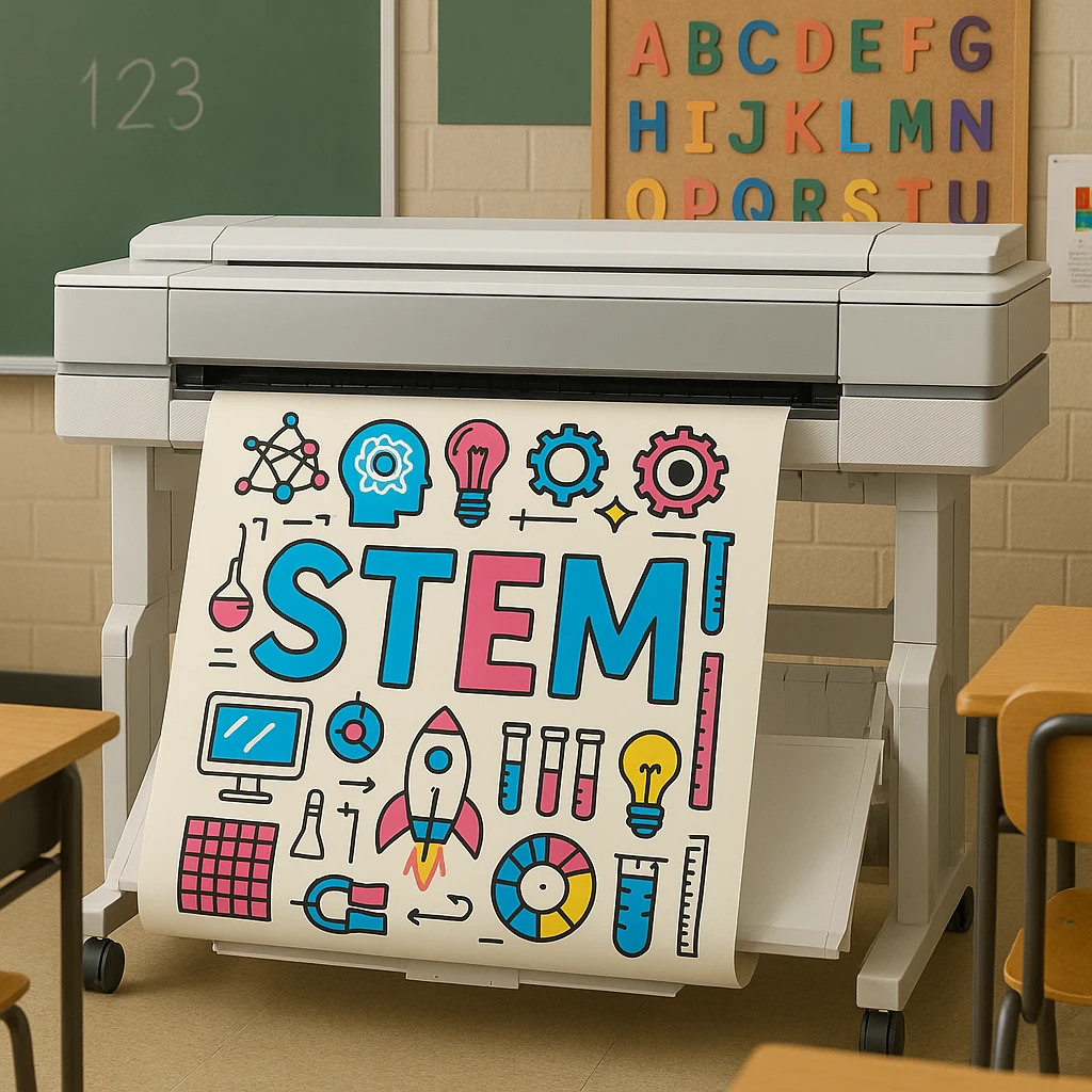
Bringing Your Posters to Life with School Poster Makers
Knowing the principles of great design is one part of the equation – the other is having the right tools to turn your ideas into reality. This is where School Poster Makers comes in. High-quality poster maker machines can empower teachers to create professional-looking posters on demand, right at school. Instead of buying generic pre-made posters or waiting weeks for a print shop, educators can design a poster that perfectly fits their class’s needs and print it out in minutes. The result? Custom visuals that align exactly with your curriculum and students.
Two examples of top-of-the-line poster maker systems for schools are the Classroom Pro and Campus Pro series. These are specialized wide-format printers designed with K‑12 education in mind. The Classroom Pro series, for instance, includes models that print vibrant, full-color posters up to 36 inches wide – ideal for indoor educational materials. They use dye-based inks to produce bright images on coated paper, which is perfect for things like classroom charts, maps, or inspirational quotes. Classroom Pro printers come bundled with easy-to-use design software (often including templates for educators), plus starter supplies like poster paper rolls and ink, so a school can get up and running immediately. The convenience of having everything in one package means even teachers with no graphic design experience can start creating posters for their room with minimal hassle.
Meanwhile, the Campus Pro series is built for versatility and durability. These poster makers use pigment-based inks that are water-resistant, allowing schools to create both indoor and outdoor visuals. Imagine printing a banner to hang outside for the school science fair, or durable posters for the gymnasium or hallway that won’t fade quickly. The Campus Pro can handle a variety of media types – from standard paper to vinyl banner material – making it suitable for large-scale visuals like event announcements, sports tournaments, or graduation signs. Despite their advanced capabilities, these machines are designed to be teacher-friendly. They often include preset modes for common poster sizes and auto-adjust settings, so you don’t need to be a tech expert to print a simple banner for the school play.
Investing in a school poster maker system offers more than just convenience; it can actually save money in the long run. Schools often find that printing posters in-house reduces costs compared to outsourcing or buying premade materials. Plus, there’s the benefit of time – a teacher can conceive an idea in the morning and have the poster on the wall by the afternoon. This responsiveness means your classroom visuals can always be up-to-date and relevant. Teaching about a breaking news event in economics? Print a fresh infographic to discuss the next day. Noticed your students need a refresher on lab safety rules? Whip up a quick poster using a template and have it ready by the next lab session.
Another advantage is the ability to customize and personalize. With a tool like School Poster Makers, you can include your school’s name, mascot, or slogan on materials, or tailor content to the specific units you’re teaching. The Classroom Pro and Campus Pro printers come with software that often has hundreds of education-themed templates – everything from alphabet charts to world maps – which you can modify with your own text or images. Teachers who are not confident in design can start with these templates, ensuring the final product looks polished. And for those who are more design-savvy, the sky’s the limit – you can create entirely original designs for your classroom or even have students design posters as part of a project and then print them out to display.
Lastly, these high-end poster maker systems typically come with support and training, which is important for schools. For example, packages might include on-site setup, a warranty with next-business-day service if something goes wrong, and access to customer support for troubleshooting or questions. This means a teacher or school tech coordinator can feel confident that they won’t be left on their own to figure out issues. Reliability is crucial because once you start integrating custom posters into your teaching, you’ll want that printer up and running whenever inspiration strikes.
In summary, combining solid design principles with the capabilities of School Poster Makers tools is a recipe for success. Great posters begin with understanding your audience and crafting a clear, engaging visual message – and they culminate in a high-quality print that does justice to your vision. Whether it’s a single Classroom Pro printer transforming one teacher’s room, or a Campus Pro serving an entire school’s needs for banners and posters, having the right poster maker can elevate the visual learning environment across the board.
Conclusion
Classroom posters have the power to enrich the educational experience – they make learning visible, add color and energy to the environment, and serve as constant teaching aides on the walls. From the whimsical, picture-heavy posters in an elementary class to the content-rich infographics in a high school, the best posters share common traits: they are clear in purpose, visually appealing, and thoughtfully designed for their audience. By applying the principles of good design (clarity, effective use of color, logical layout, and meaningful imagery) and tailoring your approach to the age group, you can create posters that truly resonate with students.
Furthermore, with tools like the Classroom Pro and Campus Pro series from School Poster Makers, educators are empowered to bring these ideas to life with ease. No longer are you limited to what you can find in a teacher supply store – you can design exactly what your class needs, when you need it. This opens up a world of possibilities for keeping your classroom visuals fresh, relevant, and impactful.
In the end, what makes a great poster is the impact it has on your students. If a poster captures their attention, reinforces a lesson, sparks a question, or simply makes them smile and feel motivated, then it has done its job. As you plan your next educational poster, remember the tips and strategies discussed here. Start with a clear goal, follow sound design practices, and don’t be afraid to get creative. Your students will thank you for it – every time their eyes wander to the walls and they subconsciously review what they’ve learned, or feel inspired by a quote you placed just for them, the poster is working its magic. In a very real sense, great posters help teach and inspire even when you’re not actively teaching. And that is what makes them such a valuable asset in any K‑12 classroom.